Information Technology Reference
In-Depth Information
text messages that are timestamped and GPS tagged. To visualize these data,
the user loads a 24 hour clock visualization component, a text query component,
and a map, resulting in the top image in Figure 2. The map shows locations were
tweets were sent and the clock displays dots at times tweets were sent.
Next (bottom left image) only tweets from the afternoon are shown, by select-
ing (clicking and dragging) a part of the clock. This automatically updates the
dots displayed both on the clock and the map. The selection is further restricted
to two smaller areas by clicking and dragging on the map. The user also zooms
in, and selects only tweets containing the word “festival” (in Japanese) using
the text query component (bottom right image). The contents of an individual
tweet are also examined by hovering over the location of the tweet.
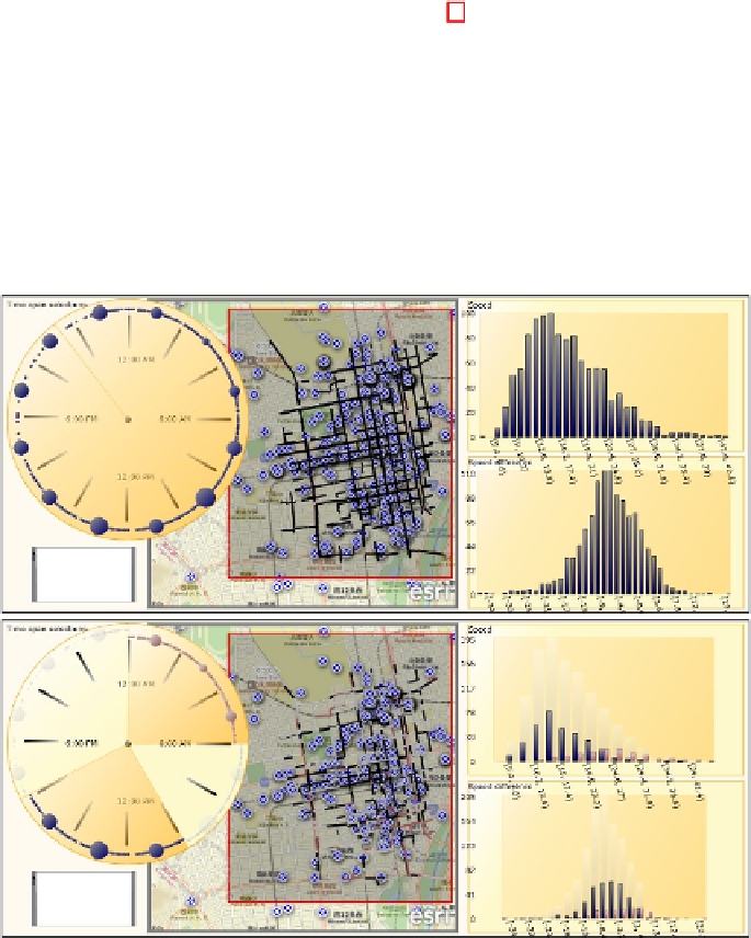
Fig. 3.
Mash-up of Twitter data and taxi probe car (per road segment) data.
Top:
Data is joined on timestamps (24h clock, upper left) and geographic position (map,
center). Twitter data also has a text filter. Taxi data also has speed and speed difference
compared to summer (histograms).
Bottom:
Grouping data by time, night vs. noon.
In Figure 3 the user continues by adding a new data source with taxi probe car
data. This contains road segments. For each road segment in the city there is the
geographical location, a timestamp, the average speed of and average number of
sensor equipped cars passing each 5 minute interval, and the difference in average