Geography Reference
In-Depth Information
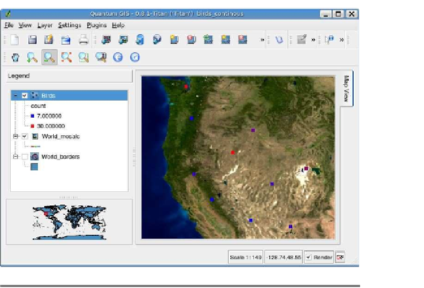
Figure 3.10: QGIS continuous color renderer results
When we apply the renderer, we get a nice display, as shown in Fig-
or the individual classes—in fact, there are no options to do that. It
gives us a relative view of how the bird counts are distributed, but it is
purely qualitative. We can't tell from the legend what a particular color
represents in terms of actual number of birds at a given location. Of
course, we could use the identify tool (we haven't talked about this yet)
to find out.
This is a quick way to render the data and get a feel for how things
are distributed. Harrison isn't fully satisfied with the result—he wants
more control, and as we'll see, the graduated renderer is better suited
to the task.
5.
In this and other examples, you'll notice we've added a background image to enhance
the display. You'll see how to add rasters in the next chapter.


Search WWH ::

Custom Search