Graphics Reference
In-Depth Information
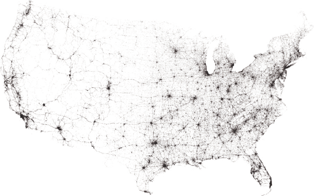
FIGUR E 1-16
Everything mapped at once
Again, although not to be taken lightly, the map tells you more about
the country's road network than it does the accidents.
A look at crashes over time shifts focus to the events themselves.
For example, Figure 1-17 shows the number of accidents per year,
which tells a different story than the total in Figure 1-15. Accidents still
occurred in the tens of thousands annually, but there was a significant
decline from 2006 through 2010, and fatalities per 100 million vehicle
miles traveled (not shown) also decreased.
Seasonal cycles become obvious at month-by-month granularity,
as shown in Figure 1-18. Incidents peak during the summer months
when people go on vacation and spend more time outside, whereas
during the winter, fewer people drive, so there are fewer crashes. This
happens every year. At the same time, you can still see the annual
decline overall between 2006 and 2010.
F I G U R E 1-17
Annual fatal accidents

Search WWH ::

Custom Search