Graphics Reference
In-Depth Information
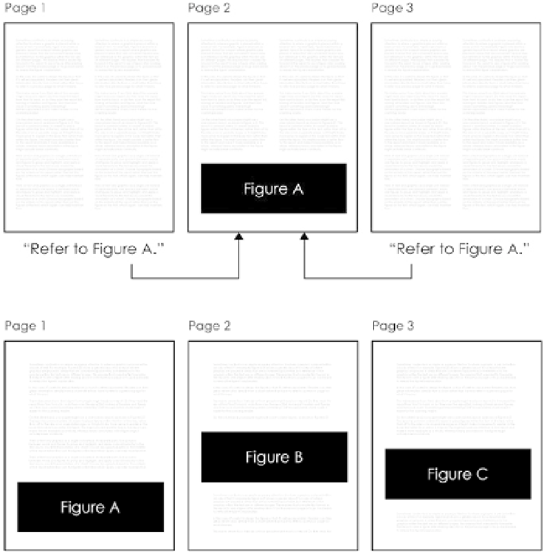
FIGURE 6-20
Generic report
layout with separated figures
and text
FIGURE 6-21
One-column layout
for a report with embedded charts
Think of text and graphics as a single unit instead of separate parts. Use space
in between words and figures to group and highlight, and apply a visual hier-
archy to the text as you would the annotation of a chart. Choose typography
based on the entirety of the report rather than just the figures or the text,
which again, can help maintain flow.
R E L ATAB I LIT Y
A great way for readers to connect with a visualization is to let readers see the
data as it pertains to them. It's not surprising that people spend more time
interacting with data that they somehow see themselves in or can relate to
their surroundings.
For example, the line graph in Figure 6-22 shows the probability of death
within a year in the United States given your age. One line is for women and
the other for men. There's an upward trend overall that shows an increased
Search WWH ::

Custom Search