Graphics Reference
In-Depth Information
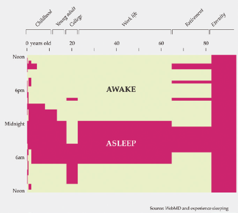
FIGURE 6-10
Sleep Schedule
(2010),
http://datal.ws/22
At the end of the day, looks matter. After all, visualization is, well, visual, so
people judge based on what you show and how you show it. Often, a poor
chart doesn't mean poor analysis, but many people see it this way, regardless
of whether it's right.
People buy things (or at least look at them more closely) in a store based on
looks, and the same thing applies to visualization. For example, Figure 6-12
shows graphs with the same data, but they look different. If you had to read
a report filled with graphs, which aesthetic would you choose?
Note:
As you know, beauty is in the eye of
the beholder, so a visualization with software
defaults can look great. The beauty is in the
data. A text file of numbers can be beautiful,
but that inner beauty isn't obvious to everyone.
That said, thoughtful aesthetics doesn't compensate for visu-
alization with a poor foundation (the data). You need both
sound analysis and design that considers your objectives
and your audience. Without the former, you just have pretty
pictures, and without the latter, you have software output.
Search WWH ::

Custom Search