Graphics Reference
In-Depth Information
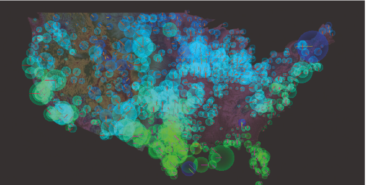
For example, as shown in Figure 6-8, Nicolas Garcia Belmonte visualized
wind patterns in the United States based on data from the National Weather
Service. The interactive animation shows the last 72 hours of wind motion.
Lines represent wind direction, the radius of circles represents speed, and hue
represents temperature. Each mark is a weather station, which you can mouse
over for additional details.
In contrast, Martin Wattenberg and Fernanda Viégas also visualized wind
patterns using the same data, but with a different look and feel, as you saw in
Chapter 1, “Understanding Data,” and shown in Figure 6-9. Higher line density
and longer segments represent greater wind speeds.
The first map is modular showing a circle for each of 1,200 weather stations.
It feels like an exploratory tool. The second map interpolates wind paths and
feels more like an art piece that you sit back and digest. Both provide similar
insights and help you infer current wind patterns, but because the former
is more tool-like, you might approach the data with an analytical mindset,
whereas you might approach the latter like you would a painting in an art
galler y.
FIGURE 6-8
United States
Wind Patterns
(2012) by Nicolas
Garcia Belmonte,
http://www
examples/winds/
Search WWH ::

Custom Search