Graphics Reference
In-Depth Information
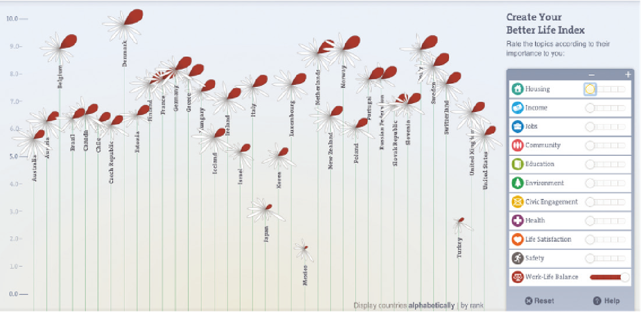
FIGURE 6-4
A custom Better Life Index
Imagine you run a fundraiser with a financial goal, and you receive hundreds
of donations, so you have a data point for every donation: the dollar amount,
who it's from, and where each generous contributor lives. Although it might
be interesting to see the distribution of donations, the total amount raised
could be all that people care about. You don't need to visualize data just
because you have it.
You might also not have a lot of data to show. It's possible (and likely) that
the only numbers available are aggregates instead of raw data. You see this
in magazines a lot, labeled as such and such “by the numbers” in a sidebar
feature. It's a bunch of numbers that represent different but related things,
with different units. It's okay to print the actual numbers.
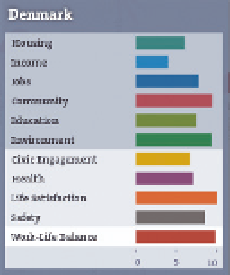
FIGURE 6-5
Topic breakdowns
for a country
For example, consider three estimates about the state of the world. Life expec-
tancy at birth is 70 years, the literacy rate of youth females ages 15 to 24 is
87 percent, and the gross domestic product is approximately $70 trillion. You
might be inclined to visualize this simply because there are numbers. Maybe
you make something like Figure 6-6, but there isn't a good reason for it because
there aren't any other values to compare to for each of the estimates.
Search WWH ::

Custom Search