Graphics Reference
In-Depth Information
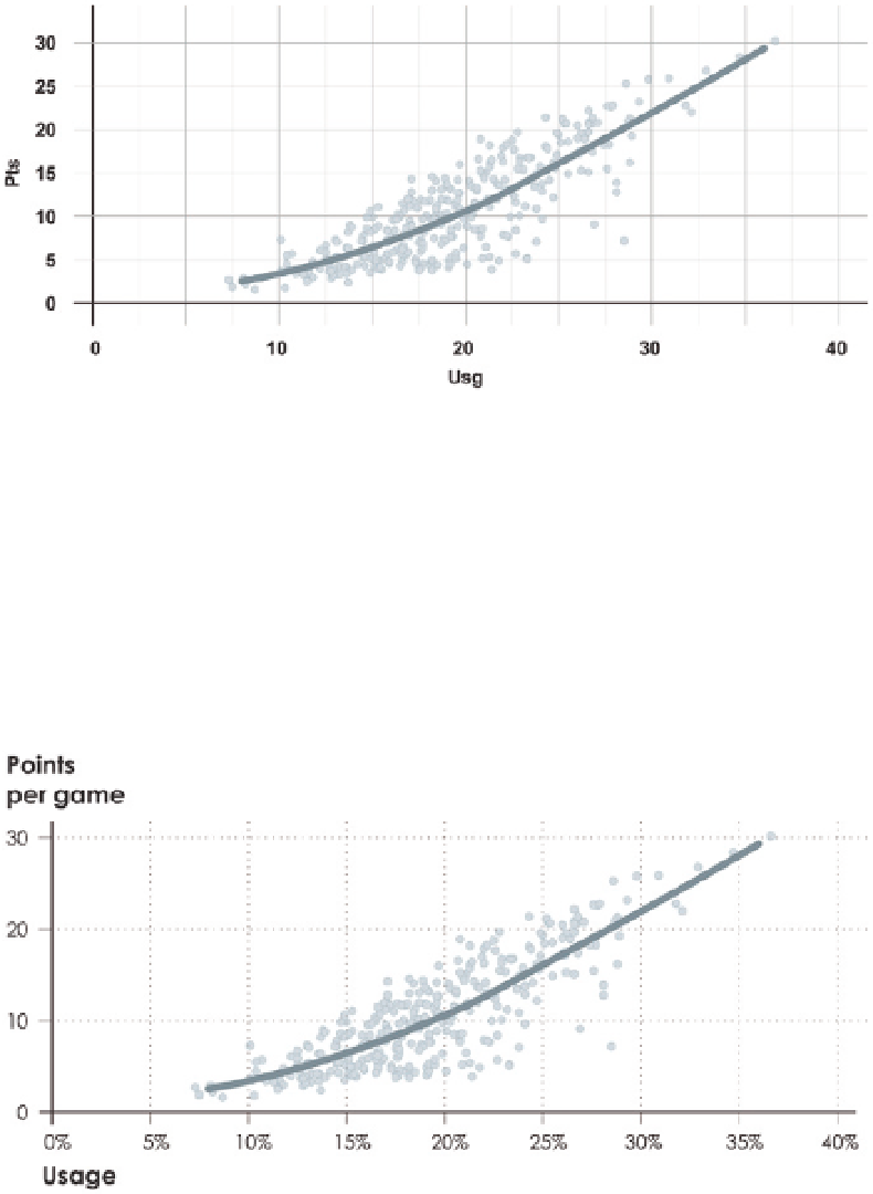
Still though, the fitted line is obscured by all the dots, because (1) it's thin com-
pared to the radius of each dot and (2) it still blends in with the grid behind it.
Figure 5-3 changes the color to blue to make the data stand out more, and the
width of the fitted line is increased so that it clearly rests on top of the dots.
FIGURE 5-3
Focus of chart
shifted to fitted line with color
and width
The chart is a lot more readable now, but if you imagine people viewing
the graphic like they would a body of text—from top to bottom and left to
right—more descriptive axis labels and less prominent value labels can help,
as shown in Figure 5-4. The text within the chart works similar to how it does
in an essay or a topic. Headers are often printed bigger and in a bold font
to provide both structure and a sense of flow. In this case, the bolder labels
provide immediate context for what the chart is about. Also, notice fewer
and less prominent gridlines, which directs focus further to the upward trend.
FIGURE 5-4
Grid and value
labels adjusted and fewer, less
prominent gridlines
Search WWH ::

Custom Search