Graphics Reference
In-Depth Information
How deeply can you read into the data, though? Look at gas prices across
your country, and there's variation. Heck, look at two gas stations within a
few blocks of each other, and there can be a big difference. So although you
can see general patterns, you shouldn't be too quick to judge as you explore.
This data in particular comes from a variety of sources, such as government
databases and newspaper articles, and from different years.
On the other hand, some sources use well-established methodologies and
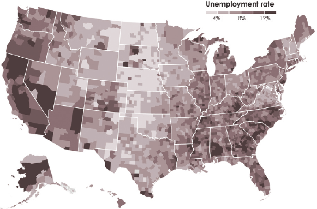
have done so for a long time. For example, the Bureau of Labor Statistics
estimates the unemployment rate every month. You saw the national estimate
over time in Figure 4-17, but you can also see the data by county, as shown
in Figure 4-32. The map shows unemployment rate by county during August
2012. You can see high rates on the West Coast and in the Southeast and lower
unemployment in the Midwest.
FIGURE 4-32
County choropleth map
Search WWH ::

Custom Search