Graphics Reference
In-Depth Information
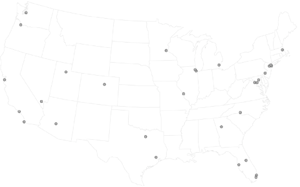
FIGURE 4-27
Dots in a geographic coordinate system
Figure 4-28 uses bubbles for the airports, sized by the number of outgoing
flights. So, with the addition of an area as visual cue, you don't just see where
the busiest airports are, but also how busy they are relative to each other.
Atlanta International served the most outgoing flights in 2011, followed by
Chicago O'Hare, Dallas-Fort Worth, Denver, and Los Angeles.
Rather than separate locations, you might want to explore connections
between locations. For example, in recent years, people have visualized global
friendships on social network sites such as Facebook and Twitter. It's one
thing to see where people like to use the sites, but it's another to see how
they interact.
With the flight data, you already saw counts for outgoing flights via bubbles
on a map, but where did those flights go to? Each flight has an origin and a
destination. Figure 4-29 shows these connections. The brighter a line is, the
Search WWH ::

Custom Search