Graphics Reference
In-Depth Information
You saw repetition in the crashes data: More people travel during the summer
months; more people leave work around 5 in the afternoon and head home;
and more accidents occur on Saturday than any other day of the week. This
information can be used to make sure there are enough people staffed during
each day of the week and when to allot vacation times.
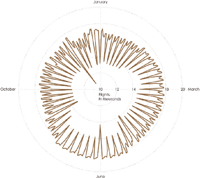
Flight data from the Bureau of Transportation Statistics shows a similar cycle, as
shown in Figure 4-23. The chart shows a weekly cycle, with the fewest flights on
Saturdays and typically the most flights on Fridays (a contrast to car crashes).
You can see the same pattern if you switch to a polar axis, as shown in the
star plot in Figure 4-23. The data starts at the top, and you read the chart
clockwise. The closer to the center a point is, the lower the value, and greater
values move further away.
Note:
The
star plot
is also commonly referred
to as a
radar chart
,
radial plot
, and
spider chart
.
Because the data repeats itself, it makes sense to compare
like days of the week to each other. For example, compare
all Mondays. It's hard to do this when time is visualized
as a continuous line or loop, but you can split the days
FIGURE 4-23
Star plot to show
time series data
Search WWH ::

Custom Search