Graphics Reference
In-Depth Information
SUBCATEGORIES
Subcategories, the categories within categories
(within categories), are often more revealing than
the main categories. As you drill down, there
can be higher variability and more interesting
things to see.
At the least, showing subcategories can make
it easier to browse your data, because you can
visually jump to the areas that you care most
about. For example, you saw categorical hierachy
of the news in Marcos Wescamp's newsmap in
Chapter 2, “Visualization: The Medium.”
As shown in Figure 4-11, you can use a treemap
with the Pew Research survey data. It shows those
who use the Internet regularly and those who don't.
Within the group of people who use the Internet
regularly is a grouping of those who used the
Internet the day before the survey and those who
did not. However, the survey data doesn't work
well with a treemap. Whereas newsmap shows a
rectangle for each story sized by current popularity,
individuals within a survey are equally weighted.
Instead, a mosaic plot, which shows you propor-
tions within categories and category combina-
tions is more fitting. Like the treemap, you can
use a mosaic plot with multiple levels of data,
but interpretation can get difficult quickly, so
start with the minimum and work your way to
the more complex.
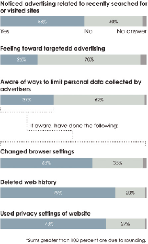
FIGURE 4-10
Stacked bars to show categories
Note:
“Map of the Market” by SmartMoney is
another popular treemap. It shows the status
of the United States stock market in real-time.
Check it out at:
http://www.smartmoney.com/
Figure 4-12 shows the proportion of people in
the survey who said they were the parent or
guardian of a child younger than 18 living in
the household.
The plot looks like one column from a stacked bar graph. The bigger a sec-
tion, the more people who gave that answer, so from this view, you see most
people said no, some said yes, and there were a few who declined to answer.
Search WWH ::

Custom Search