Graphics Reference
In-Depth Information
Color
Color as a visual cue can be spilt into two categories: hue and saturation. They
can be used individually or in combination.
Color hue is what you usually just refer to as color. That's red, green, blue,
and so on. Differing colors used together usually indicates categorical data,
where each color represents a group. Saturation is the amount of hue in
a color, so if your selected color is red, high saturation would be very red,
and as you decrease saturation, it looks more faded. Used together, you can
have multiple hues that represent categories, but each category can have
varying scales.
Careful color selection can lend context to your data, and because there is
no dependency on size or position, you can encode a lot of data at once.
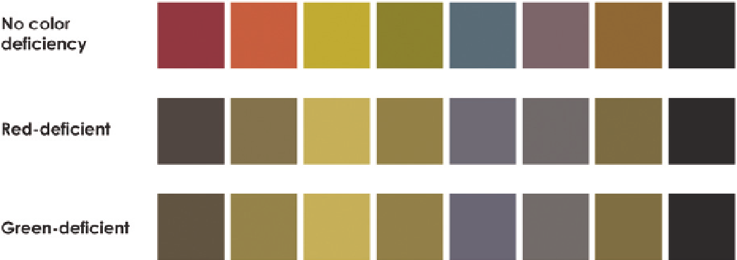
However, keep color blindness in mind if you want to make sure that everyone
can interpret your graphics. Approximately 8 percent of men and 0.5 percent
of women are red-green deficient, so when you encode your data only with
those colors, this segment of your audience will have trouble decoding your
visualization, if they can at all. Figure 3-11 shows how some shades are per-
ceived by those who are color-deficient.
Note:
Something to think about: If someone
is red-green deficient, how do they follow traf-
fic signals that use red for stop and green for
go? They note the order of the lights.
Does this mean you aren't allowed to use red and green
in your graphics? No. You can combine visual cues so that
everyone can make out differences, which you'll get to in
a few sections.
F I G U R E 3 -11
Colors as perceived by those who have color vision deficiencies
Search WWH ::

Custom Search