Graphics Programs Reference
In-Depth Information
Text Color
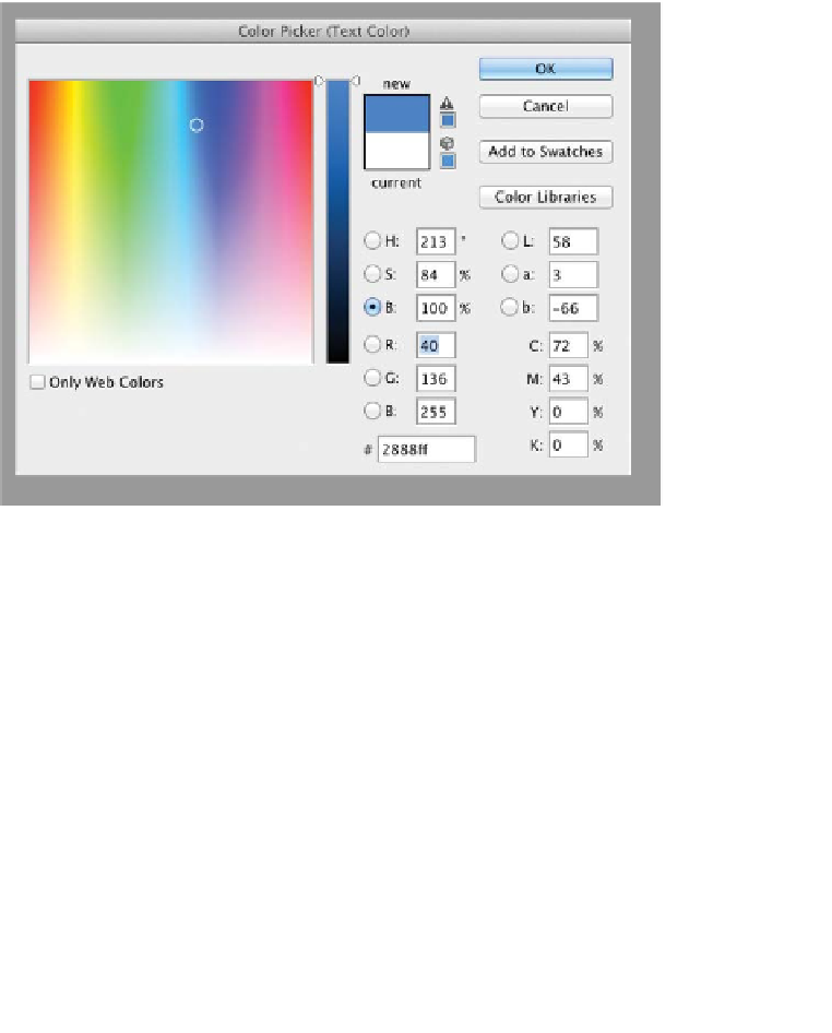
By default, text in Photoshop is black. Although black is a very
functional color (a third of my wardrobe is black or a shade of
black), it won't always work for your designs. Click the Color
Swatch to load the Color Picker window. Click a radio button for
the color model you want to work with, and then adjust the Color
slider as desired. Click in the Color Field to choose the color you
want. If you need to use a Pantone color (or at least a close equiva-
lent), click the Color Libraries button (selecting colors is covered
in depth in Chapter 6, “Painting and Drawing Tools”).
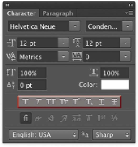
Type Enhancement Buttons
Herein lies a collection of treasures as well as several booby traps.
Some of the Type Enhancement buttons are truly useful, but oth-
ers are just plain bad design and should only be used in a pinch:
•
Faux Bold. Faux is French for
fake.
Do not use a faux bold if a
true bold is available within the font style you are using. This
button just makes the text thicker and harder to read.
•
Faux italic. Same deal here: Skewing the text to the right does
not make it italic. Always choose an italic version of the font
you are using from the Font Style field.