Graphics Programs Reference
In-Depth Information
Conversely, you might choose a loose track to improve readability
(especially if you're using all caps). Tracking, like kerning, is sub-
jective and can be learned best by studying professional examples
and looking for inspiration and guidance.
Vertical Scale
Do you need to make the text a little taller? Perhaps you want to
make the text look skinnier, or you are trying to create a stretched
look. Well, you can adjust the vertical scale from 0-1000% if you
are so inclined. Normally, this causes unintentional fluctuations in
font appearance. If you are working on a shared computer, be sure
to inspect this option and make sure it's set to 100% before design-
ing to avoid unintentional scaling.
Horizontal Scale
You c a n u s e hor i z ont a l s c a le t o c ompr e s s ( or ex p a nd ) t he w idt h
of text. By scaling down text, you can pack more text on a line.
Increasing horizontal scale can make the text appear “fatter.”
Normally, this kind of scaling is less desirable than trying to find
a font that better matches your design goals. Be sure to check to
see if scaling is applied before designing with the Type tool.
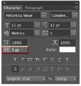
Baseline Shift
Earlier, baseline was discussed when you learned about x-height.
This is the virtual line that the characters sit on. If you need to
reposition elements such as quote marks or apostrophes for design
purposes, this property is useful.