Graphics Programs Reference
In-Depth Information
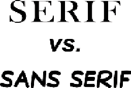
Serif vs. Sans Serif
A font has many characteristics, but the presence or lack of serifs is
one of the easiest to identify. Serifs are the hooks that distinguish
the details of letter shape. Sans serif fonts tend to be more uniform
in shape. Choosing which type of font to use will greatly depend
on your needs.
Table 12.1 shows the pros and cons of serif versus sans serif fonts.
Table 12.1 Comparison of Serif vs. Sans Serif Fonts
Pros
Cons
Serif
• Increased readability
• Thin lines can cause problems
• More traditional
for low-resolution printing or
• More options available applications like video and
due to longer history
Internet
Sans Serif
• More modern
• Letter shapes not often as
• Can compress more
unique
information into a
• Can be harder to read if too
smaller space
stylized
• Optimal for onscreen
usage
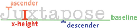
X-Height, Ascenders, and Descenders
You'll l l q u ic k ly not ic e t h a t p oi nt is i z e for font is i is a
very relative measurement. The apparent size of
your text will depend on which font you choose
and what resolution your document is set to.
Most designers look at the height of a lowercase
x
when deciding which font to use, because a lowercase
x
is a very
clean letter with a distinct top and bottom. By comparing the
x
characters, you can quickly compare and contrast fonts. This mea-
surement is combined with ascenders (strokes that go above the
top of the
x
) and descenders (strokes that go below the bottom of
the
x,
or the baseline). These three aspects provide a visual clue to
the font's purposes. Heavily stylized fonts (such as those used for
titles or logos) often have greater variety than those intended for
a page layout, where the text must take up little space yet remain
easy to read.