Geography Reference
In-Depth Information
5.2 Method and content
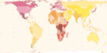
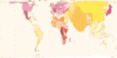
The maps shown in Figure 5.1 are cartograms. Cartograms are not a new idea in work
that seeks to visualize data. Areas on maps (sizes) can be changed to effectively show a
range of numbers that describe the way that people live at the world, at national and local
scales (see for example Kidron and Segal's
The State of the World Atlas
, 1984, or Dorling
and Thomas's cartograms of the UK, 2004). What is new here is that these maps are a step
closer to retaining the physical shape of territorial boundaries as they appear on a land area
map, whilst managing to expand, shrink or maintain the area within these new maps in
proportion to almost any variable (compare the territory shapes in the two maps in Figure
5.1). This preservation of boundary shape is achieved using Mark Newman's new version of a
cartogram-generating computer algorithm (based on Gastner and Newman, 2004), which is
itself based upon a diffusion equation from the physics of heat transfer and molecular mixing.
To explain further what you are looking at, take the example of a population map -
the space on the map available for territories is divided between territories according
to the number of people living in each territory, thus the same area in any territory rep-
resents the same number of people. This enables a more democratic representation of the
population of the world, where people are treated as equals regardless of where they live.
The size of the territory indicates the proportion of the world population that lives there.
The sea presents a problem for such density-equalizing projections, because people do not
live there. However, not mapping the sea would distort world maps so much that the benefit
of mapping (a legible visualization of data) would be negated. Therefore the sea is given a
'neutral buoyancy' or fixed area, despite the lack of people recorded as living there. Antarctica
has been treated in the same way as the sea. Another key to interpreting these visualizations
is that they only ever show and compare absolute values, never rates.
In this chapter we aim to illustrate how datasets can be mapped and used to describe the
way people live, ranging from the spread of adult literacy to the volume of car production to
the proliferation of nuclear weapons. These maps allow for comparison between countries,
and facilitate a greater understanding of how the world fits together. Mapping these subjects
provides an original way of conceptualizing the world in terms of what really affects our daily
lives: who has access to clean drinking water, where are most of the cars in the world driven,
what proportion of all malaria cases are in each country? When imagining the human world,
it is meaningful to think in terms of these subjects, not just in terms of land area.
Until recently, there was a lack of worldwide territory-level data on many variables, which
made a project such as this impossible. The United Nations Millennium Development
(a)
(b)
Figure 5.1
(a) Land area (WORLMAPPER MAP 1); (b) population (Worldmapper Map 2). These maps
are available at: www.worldmapper.org


Search WWH ::

Custom Search