Geography Reference
In-Depth Information
this information back to a central server. Our aim was to explore whether such a mechanism
might provide useful contextual information for managing a player's experience, e.g. auto-
matically recognizing when and where they prefer to play and not to play and tailoring the
delivery of text messages accordingly. The following statistical and chronological data-views
helped in understanding the players' patterns of life and their times and places of interaction
with the game.
Statistical visualization
A statistical diagram was created based on how long (in relative terms) each cell was visited
throughout the game. This gives an idea of the player's most frequently visited places. The
diagram also shows states of disconnection and complete misses, i.e. power off. An important
feature in this statistical view is the option to apply colours to cell IDs.
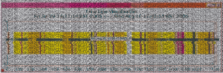
Time line visualization
In order to represent the cell IDs visited by the phone along the days, we have created a time
line visualization. In this one-dimensional graph we display the visited cell IDs. Through
the use of colour it is easy to spot patterns of repetition or prolonged visits (see Figure
16.3). By using the same colours as in the statistical visualization, it is possible to make cross
assumptions. For example, by identifying patterns for the most frequently visited cells, it is
possible to guess work and home places for the typical nine to five worker.
The data displayed can be divided for example by days of the week, mapping the patterns
of one person only, or compared with other players' data to show when they shared the same
cell and at what time (see Figure 16.4).
16.5 Discussion
In this chapter we have explored the possibility of using mobile phones as data capture
devices where data can be location tagged and visualized over time and supplemented with
Figure 16.3
Time line visualization - single player's pattern


Search WWH ::

Custom Search