Geography Reference
In-Depth Information
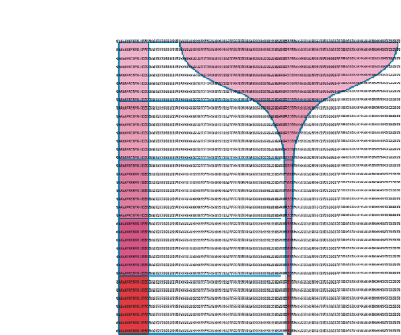
World population
arranged by
income
Distribution
of
income
Each horizontal band
represents an equal fifth
of the world's people
World
population
World
income
Richest 20%
Second 20%
Third 20%
Fourth 20%
Poorest 20%
82.7%
11.7%
2.3%
1.9%
1.4%
Figure 5.35
Sourced from Gordon (2004). This graph is redrawn based on the original
the social science sense) interesting because they show how we live now - they deliver a
clear message about the current state of the world. Whilst each map shows static(istics) we
can easily infer links between those of us who live in different places, and the connections
between the topics that are mapped.
Visualization is powerful, and can oblige us to consider what is corrupt, immoral and
profane about how life has come to be so ordered, so cheap and so unjust. And this is just a
bland interpretation of data available to all that has been reported to United Nations agencies
by governments. It is some of the best world data available at this point in time. In-depth
journalist and special investigations are not needed in order to see a lot of what is most unfair
and despotic in this world. Our interpretations are affected by our pre-existing and newly
thought through ideas, standards and beliefs, in our case that people deserve equal chances,
opportunities, and respect; and are of remarkably equal ability but rarely given anything like
equal opportunities. This is not a particularly 'radical' view, given that it chimes with the
Universal Declaration of Human Rights (1948), Article 1 of which reads: 'All human beings
are born free and equal in dignity and rights. They are endowed with reason and conscience
and should act towards one another in a spirit of brotherhood', or sisterhood.
Hopefully, the maps that these examples are drawn from provide us with a simple overview
of how people living in parts of the world can be counted, compared, contrasted and


Search WWH ::

Custom Search