Geography Reference
In-Depth Information
5.2.22 Living on $50-100 a day
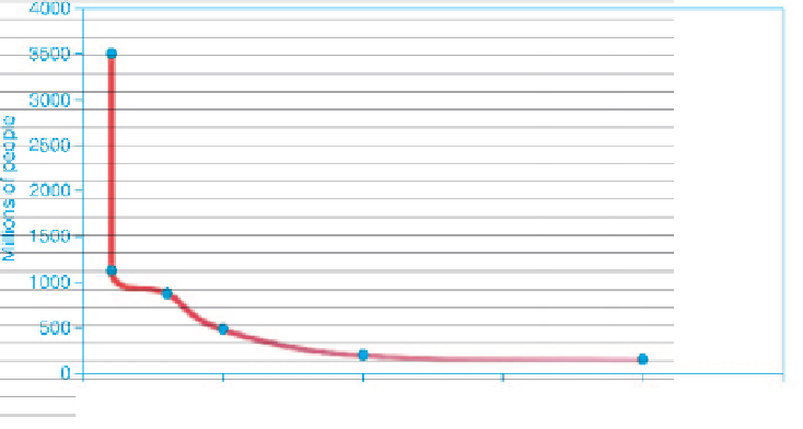
The number of people being shown on each of these maps is falling as the money to live on
increases, despite the range increasing first from $1 ($0-1 a day) to $10 ($0-10 and $10-20),
then to $30 ($20-50), now $50 ($50-100), next to $100 ($100-200), then to near infinity
($100-). From the maps showing a $10 range the numbers have decreased steadily with the
increased range (see Figure 5.24). The information in this graph is needed to understand
how these maps fit together - not only do most poor people live in India, China, Asia Pacific
and African territories; also most people are poor.
Figure 5.24 can also be read with the
x
-axis showing how much money people have to
live on. At the range of $50-100 a day, there are 488 million people, which is equivalent to
4000
3500
3000
2500
2000
1500
1000
500
0
100
150
200
250
0
50
Range in US
$
per day
Figure 5.24
Income per day (
x
-axis in dollars) and people (
y
-axis in millions)
Figure 5.25
Territory size shows the proportion of all people that rely on US$50-100 purchasing
power parity a day worldwide that lives there (Worldmapper Map 156)


Search WWH ::

Custom Search