HTML and CSS Reference
In-Depth Information
◗
3.
Save your changes to the file.
◗
4.
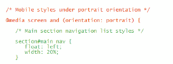
To avoid needing to type all of the style rules that apply under portrait orientation,
they have been saved for you in a text file. Open the
portrait.txt
file now in your
text editor, and then copy and paste the code from that file within the curly braces
of the
@media
rule you just created in the mobile style sheet. See Figure 8-57.
figure 8-57
inserting an @media rule for screens in portrait orientation
media query for
portrait orientation
styles implemented
when the screen is in
portrait orientation
◗
5.
Save your changes to the
mobile.css
style sheet file, and then reopen the
treebook.htm
file in your browser window or mobile device. To place your
browser window in portrait mode, resize the window so that it is longer than
it is wide with a maximum width of 500 pixels. Figure 8-58 shows the appear-
ance of the page in a resized browser window.