HTML and CSS Reference
In-Depth Information
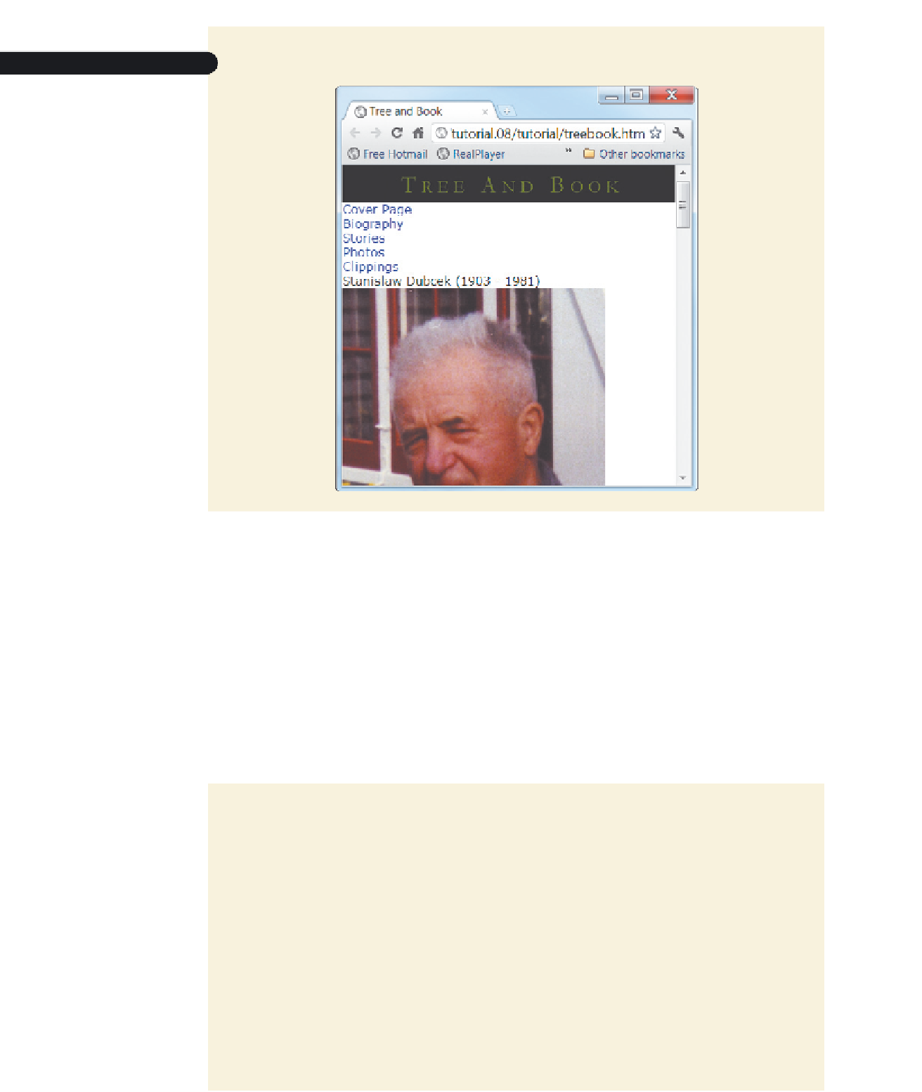
figure 8-56
Revised layout with new header banner
The styles of the remaining page elements depend on whether the page is being
viewed in portrait or landscape orientation. You'll use media queries to create a different
set of style rules for each situation.
Designing for Portrait Orientation
To create styles for a screen in portrait orientation, you can use the media query
@media screen and (orientation: portrait) {
styles
}
where
styles
is the portrait style rules. You'll use this
@media
rule now to create styles
for mobile devices in portrait orientation.
To create an
@media
rule for portrait orientation:
◗
1.
Return to the
mobile.css
file in your text editor.
◗
2.
Enter the following code at the bottom of the file:
/* Mobile styles under portrait orientation */
@media screen and (orientation: portrait) {
}