HTML and CSS Reference
In-Depth Information
Link Kevin's document to the mobile style sheet now, and add media queries to asso-
ciate each style sheet file with the correct device and viewport width.
To create a media query for the mobile style sheet:
◗
1.
Return to the
treebook.htm
file in your text editor.
◗
2.
Within the
link
elements for the
layout.css
and
effects.css
files, add the media
query
and (min-width: 501px)
to the value of the
media
attribute.
◗
3.
Directly above the closing
</head>
tag, insert the following
link
element:
<link href=”mobile.css” rel=”stylesheet” media=”only screen and
(max-width: 500px)” />
Notice that you use the
only
keyword to hide this style sheet from older browsers
that do not support media queries. Figure 8-52 highlights the newly added code
in the file.
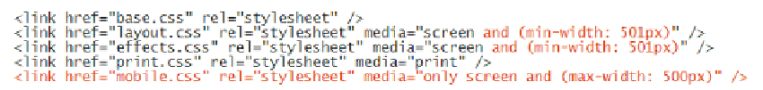
figure 8-52
Applying media queries
applies the
style sheet when the screen
viewport width is greater than 500 pixels
applies the m
obile style sheet only when the
screen viewport width is 500 pixels or less
Versions of Internet Explorer before version 9 do not support media queries and fail to
load a style sheet if a
media
attribute includes a media query. To accommodate older ver-
sions of Internet Explorer, you'll place
link
elements for the
layout.css
and
effects.css
style
sheets within a set of conditional comments. See the Tutorial 7 Insight box
Conditional
Comments with Internet Explorer
for a review of IE's conditional comments feature.
To place the
link
elements for Internet Explorer:
◗
1.
Directly below the
link
element for the
effects.css
style sheet, insert the follow-
ing code as shown in Figure 8-53:
<!-- Style sheet links for Internet Explorer prior to version 9 -->
<!--[if lt IE 9]>
<link href=”layout.css” rel=”stylesheet” media=”screen” />
<link href=”effects.css” rel=”stylesheet” media=”screen” />
<![endif]-->