HTML and CSS Reference
In-Depth Information
The Viewport
meta
Element
The viewport
meta
element was introduced by Apple for use with the iPhone as a way
of setting the properties of the layout viewport. Although not part of the HTML specifica-
tions, most current mobile browsers support this
meta
element, which has the syntax
<meta name=”viewport” content=”
properties
” />
where
properties
is the media features of the layout viewport. Web designers may
choose different widths and heights based on the content of the pages on their Web sites.
Kevin wants a layout viewport that matches the width of the device screen. To accom-
plish this, you'll apply the following
meta
element to his document:
<meta name=”viewport” content=”width=device-width, initial-
scale=1.0, maximum-scale=1.0” />
In this
meta
element, the
device-width
keyword is used to return the width of the
device's screen, whatever that may be. For a mobile device like the iPhone, this sets
the width of the layout viewport to 320 pixels; other devices have different widths. The
initial-scale
and
maximum-scale
parameters are set to 1 so that the page layout is
always scaled to match the resolution of the device screen. You'll add this
meta
element
to Kevin's document now.
To add the viewport
meta
element:
◗
1.
Return to the
treebook.htm
file in your text editor.
◗
2.
Directly below the
meta
element that defines the character set, add the following
element as shown in Figure 8-50:
<meta name=”viewport” content=”width=device-width,
initial-scale=1.0, maximum-scale=1.0” />
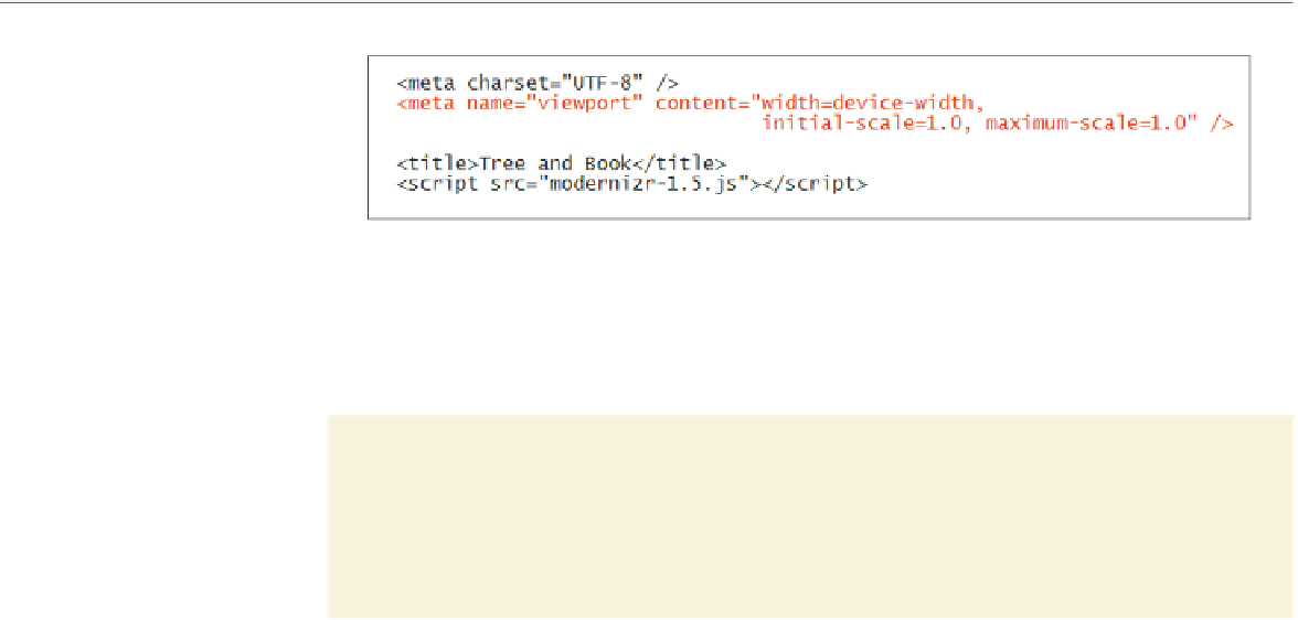
figure 8-50
Adding the viewport meta element
◗
3.
Save your changes to the file.
Now that you've set the width of the layout viewport to match the device width, you'll
begin creating a style sheet for your mobile devices. You'll add this style sheet now.
To create the mobile style sheet:
◗
1.
Use your text editor to open the
mobiletxt.css
file from the tutorial.08/tutorial
folder. Enter
your name
and
the date
in the comment section of the file.
◗
2.
Save the file as
mobile.css
.