HTML and CSS Reference
In-Depth Information
Designing for the Mobile Web
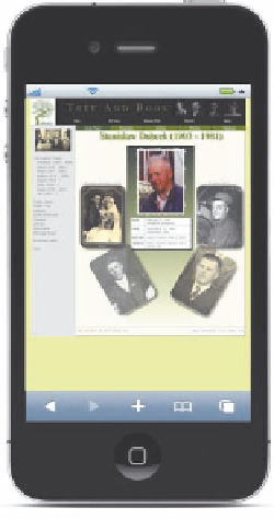
Kevin has had a chance to upload his sample page to a server and view it on his mobile
device. The page rendered correctly on his device, but in full-screen view it was small
and difficult to read; and if he zoomed into the page, only a small portion was visible
(see Figure 8-46).
figure 8-46
the tree and book page as it appears on a mobile device
sabri deniz kizil/Shutterstock.com
okicoki/Shutterstock.com
Kevin is not happy with either viewing option and would like you to design a style
sheet appropriate for the smaller screens found on most mobile devices and cell phones.
As with the print style sheet you created in the last session, Kevin wants to limit the
amount of content displayed in the mobile version of his sample page and design the
page to reduce the amount of scrolling required by readers. In general, the goal of
mobile Web design is not to recreate the desktop experience on a smaller scale on
mobile devices, but rather to re-envision the page design and content in a form that is
suitable for devices with smaller screens and limited bandwidth.
Kevin suggests that you create a mobile design that focuses only on the photos and
biographical information about his great-grandfather. Figure 8-47 shows a preview of
how he would like his sample page to appear on a typical mobile device. Notice that
Kevin wants one design for when the page is displayed in portrait mode and another for
landscape mode.