HTML and CSS Reference
In-Depth Information
center
; or you can set the starting position explicitly using a percentage or one of the
CSS units of measure.
The default shape of a radial gradient is
ellipse
with the specific dimensions based
on the size of the containing object and the size of the gradient. For example, if the
object is taller than it is wide, the radial gradient will be as well, appearing in the form of
an elongated circle. You also can specify the gradient shape as
circle
, so that the gradi-
ent takes the shape of a perfect circle regardless of the object's dimensions.
By default, a radial gradient covers the entire object with the last color placed at the
corner farthest from the center of the gradient. You can set a different stopping point
using the following keywords:
•
closest-side
: Stop at the side closest to the gradient's center.
•
closest-corner
: Stop at the corner closest to the gradient's center.
•
farthest-side
: Stop at the side farthest from the gradient's center.
•
farthest-corner
: Stop at the corner farthest from the gradient's center.
•
contain
: Contain the gradient entirely within the object (synonymous
with
closest-side
).
•
cover
: Cover the entire object with the gradient (synonymous with
farthest-corner
).
You also can explicitly set the size of the radial gradient using pixels or percentages.
Figure 8-25 shows examples of different radial gradients created using the
radial-gradient()
function.
figure 8-25
Radial gradients from different starting positions and shapes
background:
radial-gradient
(
left top
,
center
, red,
blue, green)
background:
radial-gradient
(
center
,
closest-side
, red,
blue, green)
background:
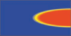
radial-gradient(
right
, red
30%
, yellow
35%
, blue
40%
)
You can explore how to define your own radial gradients using the
demo_radial_
gradients.htm
page in the tutorial.08/demo folder.
Defining Gradients with Browser Extensions
The syntax of linear and radial gradients is not yet finalized at the time of this writing, and
support for gradients is uneven in the current browser market. To support the widest range of
browsers, you should use browser extensions in your style sheets. The
linear-gradient()
and
radial-gradient()
functions were based on Mozilla's
-moz-linear-gradient()
and
-moz-radial-gradient()
functions. Beginning in 2010, WebKit also began support-
ing the
linear-gradient()
and
radial-gradient()
functions as a browser extension,
preceded by the
-webkit-
prefix.
However, before 2010, installations of WebKit used the function
-webkit-gradient(linear,
start
,
stop
, from(
color
), color-
stop(
percent, color
), to(
color
) )
to create linear gradients, where
start
provides the starting location of the gradient,
stop
defines the gradient's stopping location,
color
is a color value or color name, and