HTML and CSS Reference
In-Depth Information
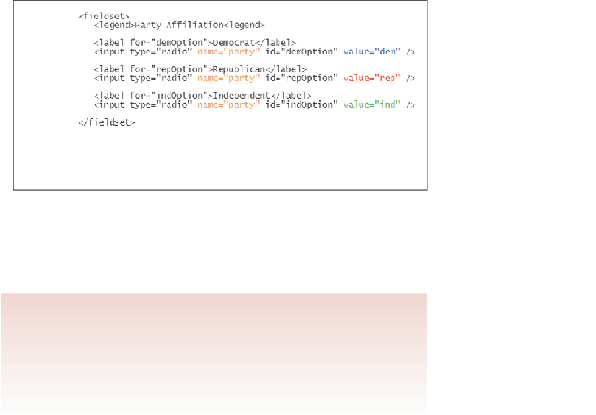
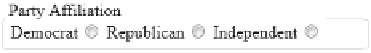
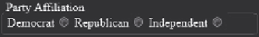
figure 6-35
creating a group of option buttons
HTML code
rendered option buttons
In this sample code, all of the option buttons are associated with the
party
field with
values of
dem
,
rep
, and
ind
, respectively. The option buttons are organized within a field
set, and each label within the field set is linked to a specific option button control using
the
for
and
id
attributes. When you link a label to an option button, users can select
the option by clicking either the label or the option button. For example, clicking on the
label text
Democrat
would cause a browser to select the
demoOption
option button.
Creating a Group of Option Buttons
• To create a group of option buttons associated with a single field, add the
input
elements
<input type=”radio” name=”
name
” value=”
value1
” />
<input type=”radio” name=”
name
” value=”
value2
” />
<input type=”radio” name=”
name
” value=”
value3
” />
...
where
name
is the name of the data field, and
value1
,
value2
,
value3
, etc. are the
field values associated with each option.
• To specify the default option, add the
checked
attribute to the
input
element as
follows:
checked=”checked”
You'll create option buttons now for the
serviceFriendly
field to record whether
a customer was treated well by the Red Ball Pizza staff. To keep the control elements
for the option buttons organized as a group, you'll nest them and their labels within a
fieldset
element with the class name
optionGroup
.