Graphics Programs Reference
In-Depth Information
Step Six:
Now, here's the thing: although this
can give you a perfectly accurate white
balance, it doesn't mean that it will look
good. White balance is a creative decision,
and the most important thing is that your
photo looks good to you. So don't get
caught up in that “I don't like the way the
white balance looks, but I know it's accu-
rate” thing that sucks some people in—
set your white balance so it looks right to
you. You are the bottom line. You're the
photographer. It's your photo, so make it
look its best. Accurate is not another word
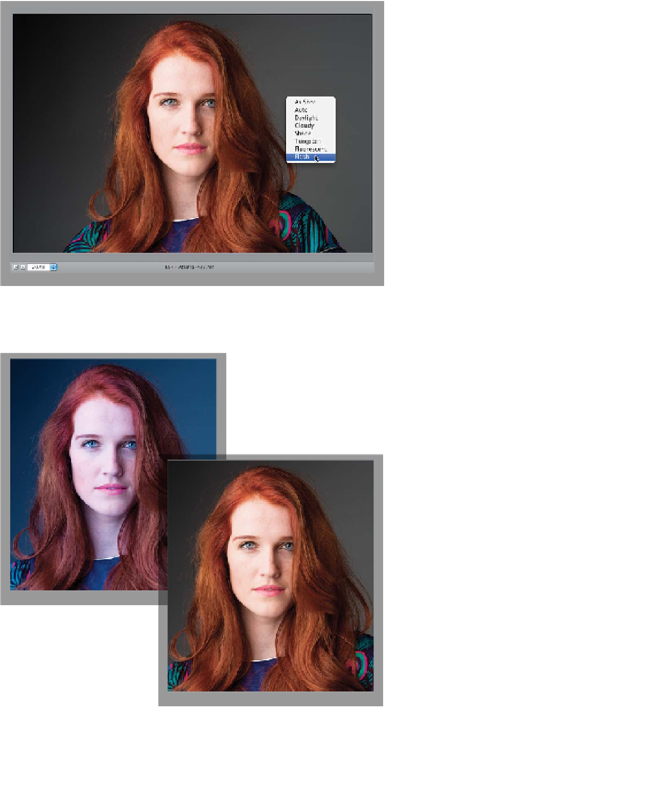
for good. By the way, you can just Right-
click on your image to access the White
Balance pop-up menu (as shown here).
Step Seven:
Here's a before/after so you can see
what a difference setting a proper white
balance makes (by the way, you can see
a quick before/after of your white balance
edit by pressing the letter
P
on your key-
board to toggle the Preview on/off).
TIP: Using the Gray Card
To help you find that neutral light
gray color in your images, I've in-
cluded an 18% gray card in the
back of this topic (it's perforated,
so you can tear it out). Once your
lighting is set, just have your subject
hold it while you take one shot. Then,
open that image in Camera Raw, and
click the White Balance tool on the
card in your image to instantly set
your white balance. Now, apply that
same white balance to all the other
shots taken under that same light
(more on how to do that coming up
in the next chapter).
Before: The As Shot
white balance has
a bluish tint
After: With one click of the White Balance
tool, everything comes together