Graphics Programs Reference
In-Depth Information
Step Three:
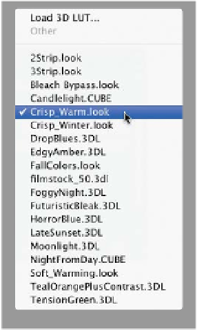
There are a few effects that have extra
options. For example, from the same
pop-up menu, choose
NightFromDay
.CUBE
and some new options appear
at the bottom of the Properties panel
(shown here). Since they're radio buttons,
all you can do is choose one button on
the left and one on the right, and as you
click on them (as shown here), they cre-
ate variations of the look you chose. Also,
there are a few handy buttons across the
bottom of the Properties panel: The one
I use the most is the Eye icon, which tog-
gles the Color Lookup adjustment layer
on/off (and saves you a trip up to the
Layers panel). If you click on the first icon
from the left, it makes the effect only
affect the layer directly below it (and not
all the layers below it, like normal). The
next icon over (the eye with an arrow) is
a before/after, which is pretty similar to
turning the layer on/off with the Eye icon.
The next icon (the curved arrow) just re-
sets the entire panel to its defaults.
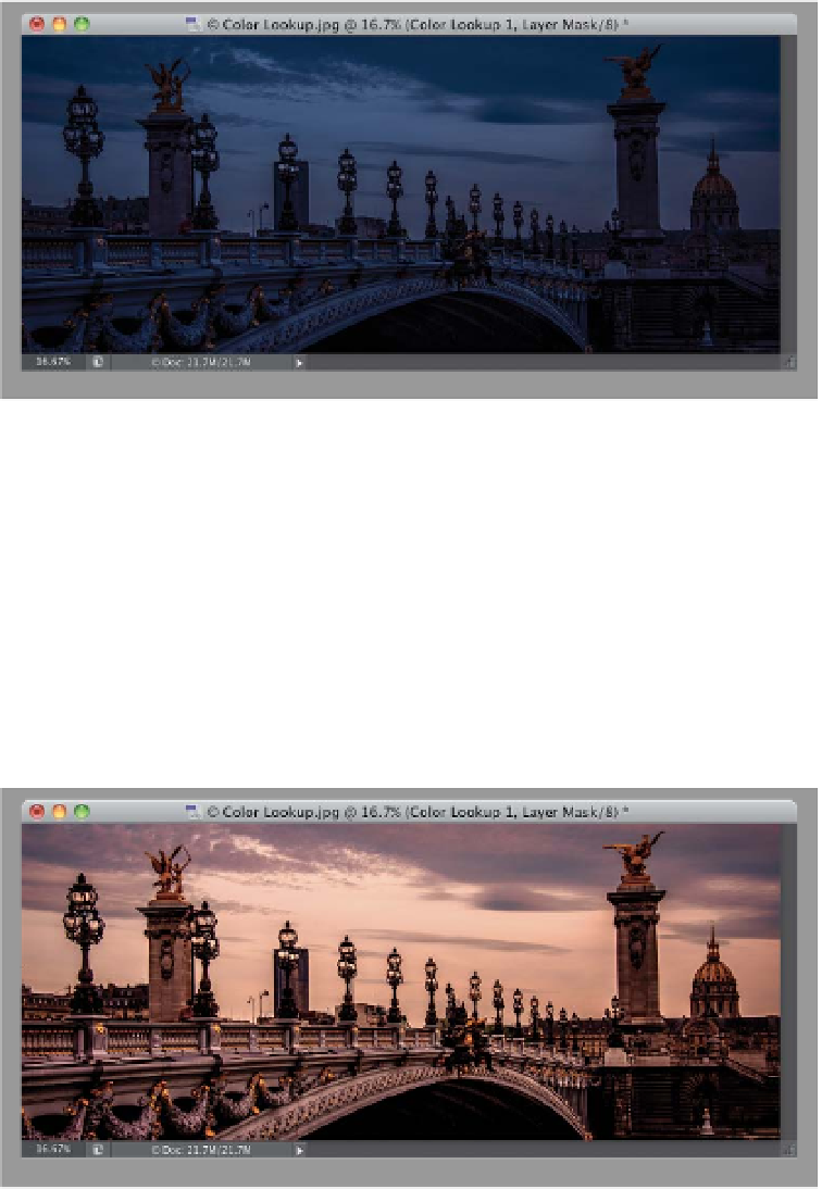
Step Four:
After trying out a few different ones,
I think for this particular image the one
that looks best to me is Crisp_Warm.look
(as shown here). One last thing: If you
choose the top choice in any of these
pop-up menus, it lets you load in a profile
(in case you downloaded some from the
web and wanted to apply one of them
to your image). It brings up the standard
Open dialog, so you can find the profile
you want to load. Of course, if you don't
have a profile you want to load, there's
no reason to choose the top choice in
the menus (which makes you wonder
why it's not the last choice in each
menu, right? Don't get me started).