Graphics Programs Reference
In-Depth Information
Step Five:
Now that you've got the hang of adjust-
ing the curve, choose
Blue
from the
Channel pop-up menu. Grab the same
point (the bottom-left corner point) and
drag upward, but this time you're going
to keep dragging until you pass the center
line and stop about halfway up the next
grid square (as seen here). Next, grab
the top-right corner point and drag
downward to just a hair or two past
the center of the first grid square (as
seen here). This gives the image more
of a teal-and-yellowish feel.
TIP: Add Grain for a Film-Like Look
If you want more of a film look, click
on the Effects icon in Camera Raw (the
fourth from the right), and at the top is
a Grain Amount slider (designed to
emulate film grain). Drag it to the right
to add more of a grainy look to your
Instagram-effect images.
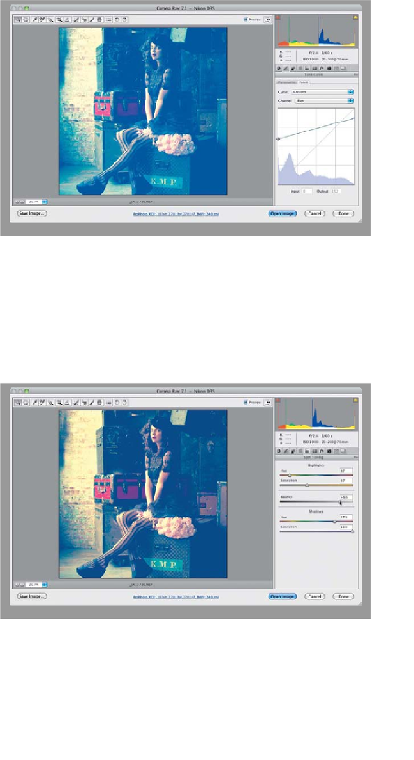
Step Six:
Next, click on the fifth icon from the left,
at the top of the Panel area, to bring up
the Split Toning panel. Here, you can add
one color tint to the highlights in your
photo, and a different one to the shadow
areas, and then you can control the bal-
ance between the two. We'll start with
the highlights, so drag the Highlights
Saturation slider to 37 (we drag the Sat-
uration slider first, so we can actually see
the hue. At its default, you can drag that
Hue slider all day and never see any dif-
ference). Then, drag the Hue slider to 47,
which gives you a yellow tint in the high-
lights. Jump down to the Shadows and
increase the Saturation to 100 and set the
Hue at 273 for a blue tint in the shadows.
Lastly, we're going to drag the Balance
slider to the right—over to +65—so there
are more blue shadows than yellow high-
lights in our split tone (as seen here).