Graphics Programs Reference
In-Depth Information
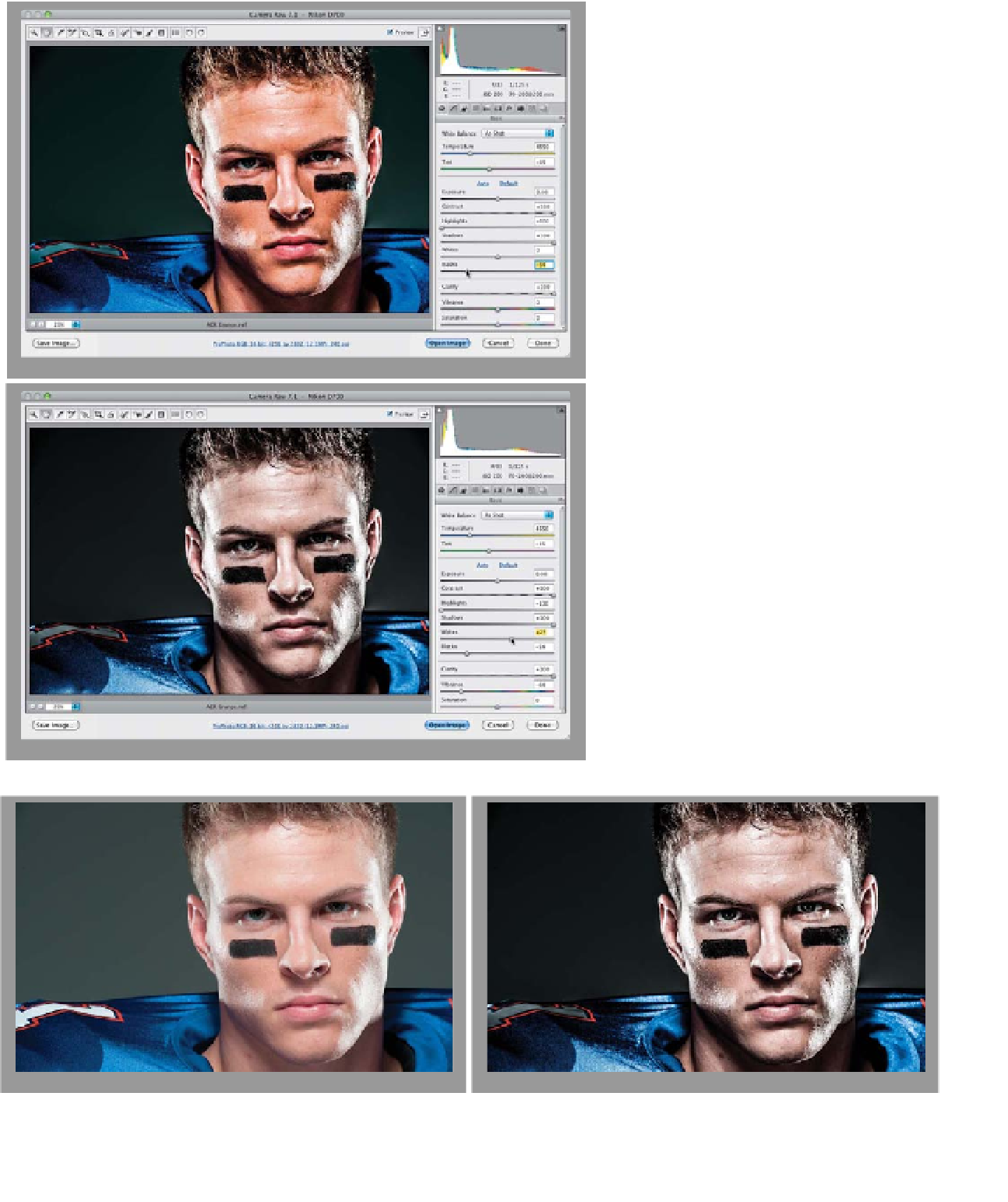
Step Three:
To keep the photo from looking too
washed out in the deepest shadow areas,
drag the Blacks slider to the left until the
photo looks more balanced (like it does
here, where I dragged it over to -54). Also,
to “crush” back the highlights (it's part
of the look of this high-contrast effect),
you're going to drag the Highlights slider
all the way to the left to -100. Okay, we're
getting close.
Step Four:
Dragging that Blacks slider over like you
did in the previous step generally makes
your colors really vivid and saturated,
but part of this effect is to intentionally
desaturate the image. So, lower the
Vibrance amount until it looks desatu-
rated quite a bit (remember, that's part
of the look). Here, I lowered it to -64.
Lastly, if the image looks a little too dark,
you can bring out the brightest highlights
by dragging the Whites slider over to the
right (as I did here—just a bit—over to
+25). You won't do this to ever y image,
but when it needs that little kicker in
the highlights, dragging the Whites slider
to the right a bit will often do the trick.
A before/after is shown below. One more
thing: is this image just screamin' for some
High Pass sharpening, or what? (See page
347 for how to add it.)
Before
After