Graphics Programs Reference
In-Depth Information
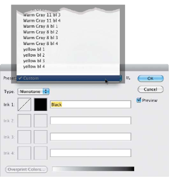
Step Three:
Once your photo is in Grayscale mode,
the Duotone menu item (which has been
grayed out and unchoosable until now) is
now open for business (if you're in 8-bit
mode). So, go under the Image menu,
under Mode, and choose
Duotone
. When
the Duotone Options dialog appears
(shown here), the default setting is for
a one-color Monotone (a cruel joke
perpetrated by Adobe engineers), but
that's no big deal, because we're going
to use the built-in presets from the pop-
up menu at the top. Here, you'll literally
find 137 presets (I counted). Now, you'd
think they'd be organized by duotones
first, tritones, then quadtones, right?
Nope—that makes too much sense (in
fact, I'm not sure they're in any order
at all).
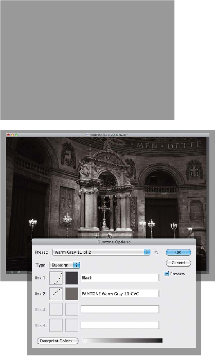
Step Four:
I thought I'd give you a few of my favorites
to get you started. One I use often is
named “Bl 541 513 5773” (the Bl stands
for black, and the three sets of numbers
are the PMS numbers of the three other
Pantone colors used to make the quad-
tone). How about a nice duotone? It uses
black and it adds a reddish brown to the
mix. It's called “478 brown (100%) bl 4,”
and depending on the photo, it can work
really well (you'll be surprised at how dif-
ferent these same quadtones, tritones,
and duotones will look when applied to
different photos). There's a nice tritone
that uses black and two grays, named
“Bl WmGray 7 WmGray 2.” We'll wrap
things up with another nice duotone—
this one's named “Warm Gray 11 bl 2,”
and gives you the duotone effect shown
here. Well, there you have it—four of my
favorites (and don't forget, when you're
done, convert back to RGB mode for
color inkjet printing).