Graphics Programs Reference
In-Depth Information
Step Five:
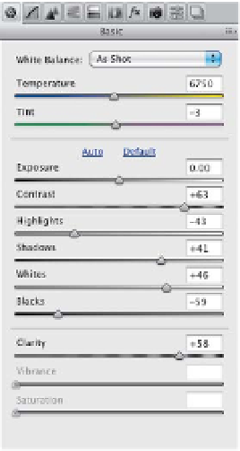
The insides of the arches are kind of dark,
so drag the Shadows slider to the right
to lighten those areas a bit (I dragged to
+41). Then, increase the Clarity amount
quite a bit, which adds midtone contrast
and makes the image more punchy and a
little brighter, too (here, I pushed it over
to +58). Also, the sky looks really white,
so let's pull back those highlights by drag-
ging the Highlights slider to the left (here,
I dragged to -43). Now, if you feel like it
could still be more contrasty (I do), then
go to the Tone Curve panel and choose
Strong Contrast
from the Curve pop-
up menu at the top of the Point tab (as
shown here on the right). If it's too much
contrast, try Medium Contrast instead.
Step Six:
There is one problem that is unique to
this particular photo—the towers on
the left and right look washed out, so
get the Adjustment Brush
(K)
, click on
the + (plus sign) button to the right of
Contrast (to reset the sliders to 0), and
then increase the Contrast slider a bunch.
Now, drag the Shadows slider to the left
and then paint over the towers (as shown
here). A before/after is shown on the
next page. Pretty striking difference, eh?