Graphics Programs Reference
In-Depth Information
Step Three:
When you talk to photographers about
great B&Ws, you'll always hear them talk
about high-contrast B&Ws, so you already
know what you need to do—you need to
add
lots
of contrast. That basically means
making the whites whiter and the blacks
blacker, which has been made easier to
do in Photoshop CS6 now that the Basic
panel has both Whites and Blacks sliders
(not to mention a Contrast slider that now
actually does a good job). So, start in the
Basic panel. Normally, you'd adjust the
Exposure slider to start things off, but
in this case, the image looks okay in the
midtones (actually, the image is all mid-
tones), so if you wanted, you could drag
a little to the left to darken it, but I'm just
leaving it set as-is. However, this flat-look-
ing image needs lots of contrast, so let's
drag the Contrast slider way over to the
right (here, I dragged to +63). That looks
a little better, but not a bunch—we've
got more to do!
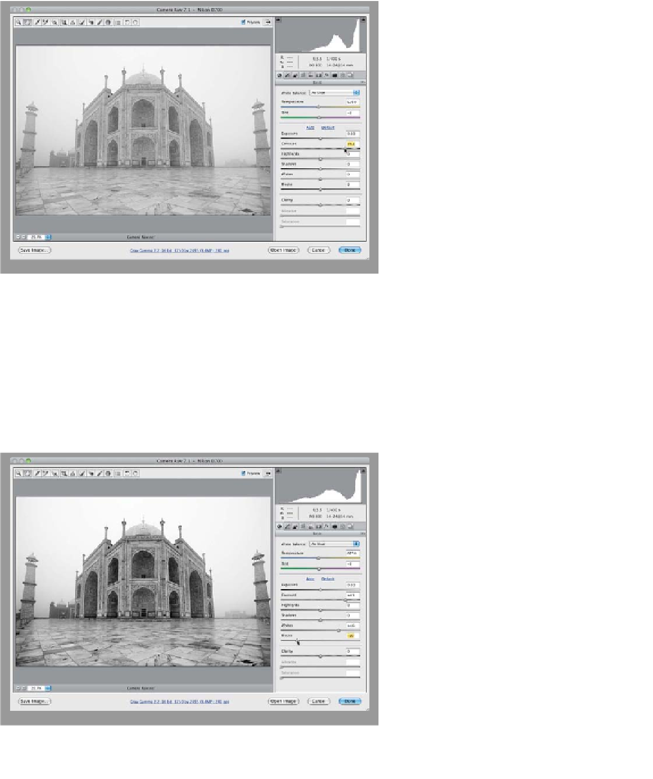
Step Four:
Now, let's set our white and black points.
Start by dragging the Whites slider as far
to the right as you can without clipping
the highlights (in other words, drag until
you see the white triangle in the top right
of the histogram appear [that's the high-
light clipping warning], then back it off just
a tiny bit, until it turns black again). Here,
I dragged it over to +46. Now, drag the
Blacks slider to the left until it really starts
to look nice and contrasty (as shown here,
where I dragged to -59). Okay, it's start-
ing to look a lot better, but we're not
quite there yet.
(Continued)