HTML and CSS Reference
In-Depth Information
var gradient = chessContext.createLinearGradient(0, 600, 600, 0);
gradient.addColorStop(0, "#D50005");
gradient.addColorStop(0.5, "#E27883");
gradient.addColorStop(1, "#FFDDDD");
// Clip the path
chessContext.beginPath();
chessContext.arc(300, 300, 300, 0, (Math.PI * 2), true);
chessContext.clip();
chessContext.fillStyle = gradient;
chessContext.strokeStyle = "red";
// Draw the alternating squares
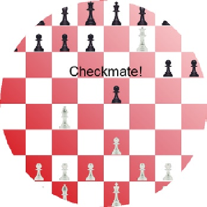
This defines a circle on the board and anything outside of that circle will not be visible. Press F5 to start the
application, which should look like Figure
10-14
.
Figure 10-14.
The chess board with a clipping path
■
If you define the clipping path after the board is drawn, the entire board will be drawn but the pieces will
be cropped so any part that is outside the clipping area will be hidden.
Note
Understanding Compositing
With all the shapes you have drawn so far, the one drawn last overlaid, or hid, whatever preceded it. This behavior
is referred to as compositing. The default behavior, called source-over, is as we've seen, to draw the current shape
on top of whatever may already be on the canvas. However, there are 11 other behaviors that you can configure
using the
globalCompositeOperation
property. These are best explained by seeing a sample of each.
In this exercise you will overlap a red square with a blue circle. You will do this 12 times, each time using a
different value for the
globalCompositeOperation
property. To make this work correctly, you'll create 12
canvas
elements, drawing the same elements on each.