HTML and CSS Reference
In-Depth Information
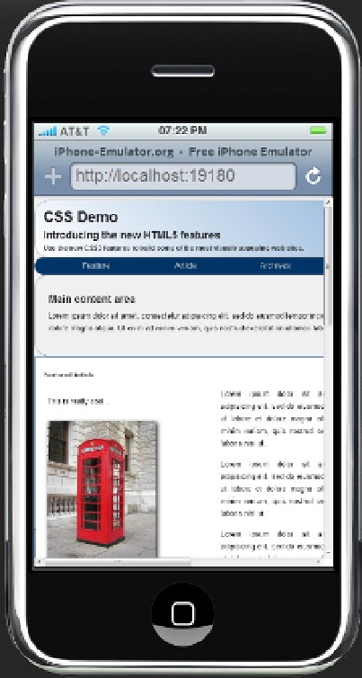
Figure 6-10.
Emulating the web page on an iPhone
Notice the buttons at the top of the page that enable you to also emulate other devices such as the iPad and
Android.
Handling Form Factors
The biggest challenge when creating web applications that work well on mobile devices is handling the various
form factors. On the larger devices you'll want to take advantage of the extra space while still making a reasonable
appearance on the smaller ones. In the samples that I've shown you so far, the device either scaled the page to fit
or cropped it. Neither approach is optimal.
There are three techniques that will help you improve how your site looks across all form factors:
•
Media queries - This allows you to apply different styles based on attributes of the
existing viewport. I will spend most the rest of this chapter demonstrating this.
•
Flexible images and videos - This simply instructs the browser to stretch or shrink the
image to fit the available space.