Graphics Programs Reference
In-Depth Information
Step 11:
Next to Intent, you have two choices:
(a) Perceptual, or (b) Relative. Theoretically,
choosing Perceptual may give you a more
pleasing print because it tries to maintain
color relationships, but it's not necessarily
accurate as to what you see tonally on-
screen. Choosing Relative may provide a
more accurate interpretation of the tone
of the photo, but you may not like the final
color as much. So, which one is right?
The one that looks best on your own
printer. Relative is probably the most
popular choice, but personally, I usually
use Perceptual because my style uses very
rich, saturated colors, and it seems that
Perceptual gives me better color on my
particular printer. So, which one should you
choose? The best way to know which one
looks best for your printer is to print a few
test prints for each photo—try one with
Perceptual and one with Relative—when
the prints come out, you'll know right away
which one works best for your printer. We'll
cover the last option, Print Adjustment,
after you make your first print.
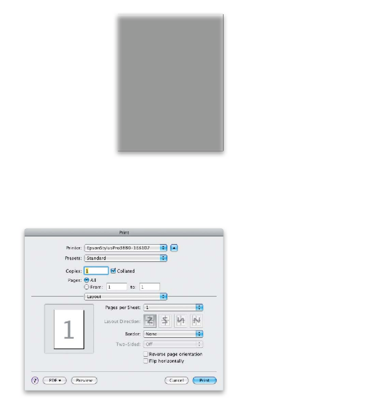
Step 12:
Now it's time to click the Print button at
the bottom of the right side Panels area.
This will bring up the Print dialog (shown
here. If you're using a Mac, and you see a
small dialog with just two pop-up menus,
rather than the larger one you see here,
click the little arrow button to the right
of the Printer pop-up menu, shown circled
here in red, to expand the dialog to its full
size, more like the one shown here).
Continued