Graphics Programs Reference
In-Depth Information
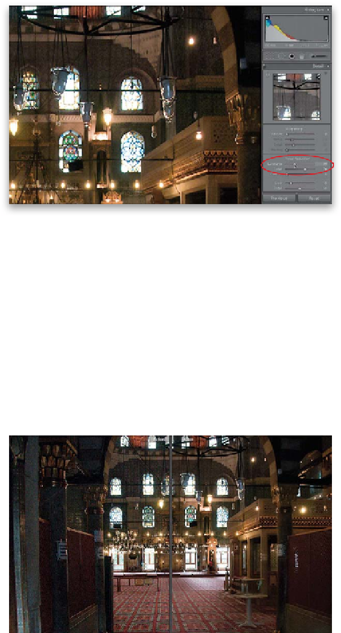
Step Three:
Now that the color noise has been dealt
with, chances are your image looks grainy.
So to reduce this type of noise (called
luminance noise), drag the Luminance
slider to the right until the noise is greatly
reduced (as shown here). I gotta tell you,
this baby works wonders all by itself, but
you have additional control with the other
two sliders beneath it. The “catch” is this:
your image can look clean, or it can have
lots of sharp detail, but it's kinda tricky
to have both. The Detail slider (in Adobe
speak the “luminance noise threshold”)
really helps with seriously blurry images. So,
if you think your image looks a little blurry
now, drag the Detail slider to the right—just
know this may make your image a little
more noisy. If, instead, you want a cleaner
looking image, drag the Detail slider to the
left—just know that you'll now be sacrific-
ing a little detail to get that smooth, clean
look (there's always a trade-off, right?).
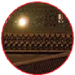
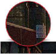
Step Four:
The other slider under Luminance
is the Contrast slider. Again, this one
really makes a difference on seriously noisy
images. Of course, it has its own set of
trade-offs. Dragging the Contrast slider to
the right protects the photo's contrast, but
it might give you some blotchy-looking
areas (the key word here is “might”). You
get smoother results dragging the slider
to the left, but you'll be giving up some
contrast. I know, I know, why can't you have
detail and smooth results? That's coming in
Lightroom 9. The real key here is to try to
find that balance, and the only way to do
that is experiment on the image you have
onscreen. For this particular image, most
of the luminance noise was gone after drag-
ging the Luminance slider to around 30
(drag ging much higher didn't yield better
results). I wanted to keep more detail, so
I increased the Detail amount to around 70.
I left the Contrast slider as is. The before/
after is shown here.