Graphics Programs Reference
In-Depth Information
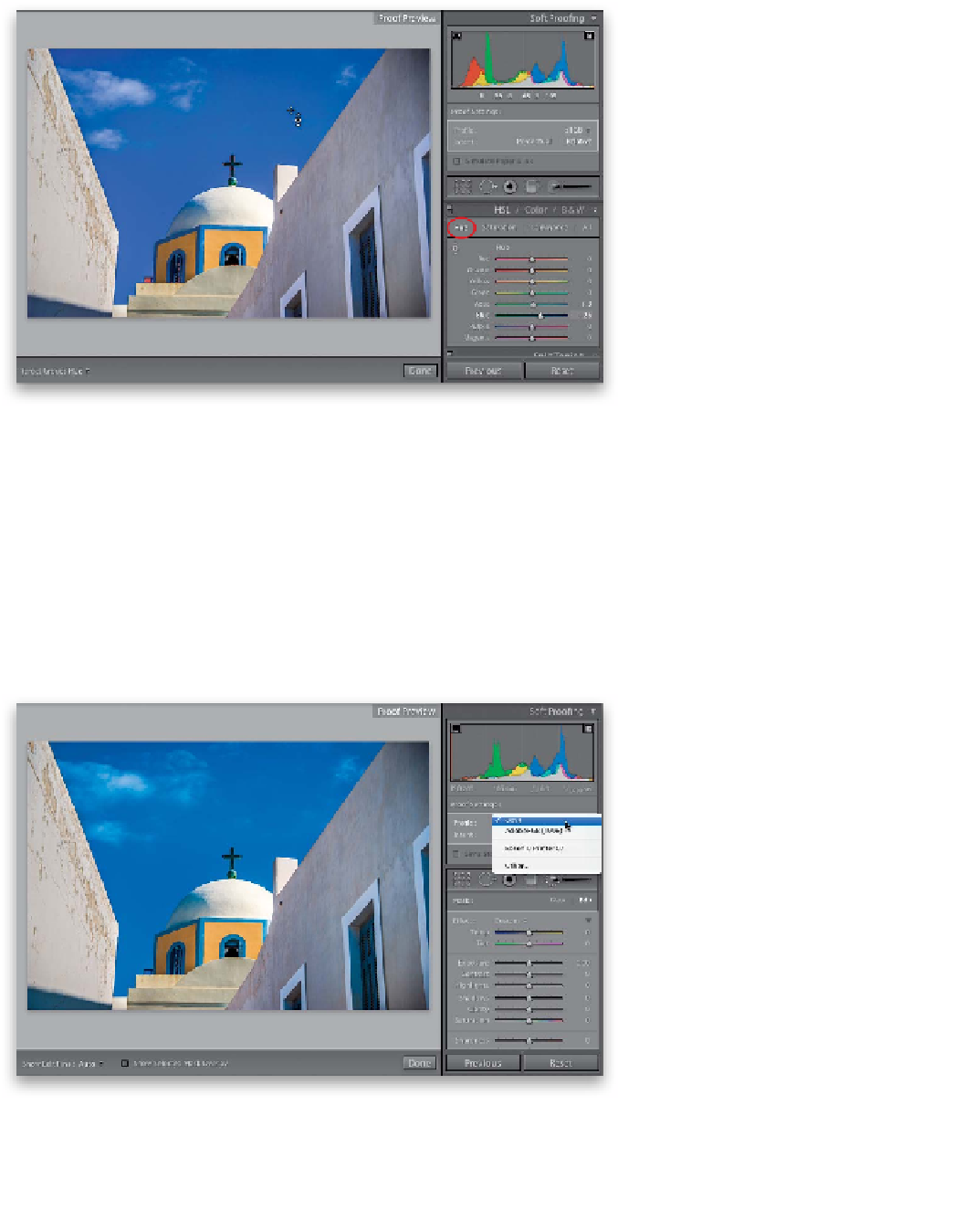
Step Seven:
So, if you're thinking the HSL version
of desaturating is pretty much like the
Adjustment Brush version, you're right—
it's just another way of desaturating the
colors enough to where they're back in
gamut. However, there is an advantage
of using the HSL sliders and that's when,
instead of desaturating the colors, you're
willing to change their hues to colors that
are actually in gamut. You do that by click-
ing on Hue at the top of the HSL panel
(shown circled here in red), then get the
TAT, put it over the red area ( just like be-
fore), and drag up until the hue has changed
enough that the gamut warning goes away.
Now, just realize that you're actually chang-
ing the colors a bit (the sky looks a bit
more purple to me now, even though we
didn't move the Purple slider), so if you're
willing to be flexible with the color a little
bit, you might be able to keep the same
amount of saturation in your image.
Step Eight:
Now, if instead of going to print, you're
sending your image to the web, the first
thing you need to do is change your color
profile to
sRGB
from the Profile pop-up
menu (the default color space for most
web browsers). Then, click the web gamut
warning icon in the upper-left corner of
the histogram (shown circled here) and the
areas that aren't likely to appear as vivid
or saturated on most regular monitors will
appear in blue (if it's still on, click on the
print gamut warning icon to turn it off).
In our case here, when we switched to
sRGB, all the colors were fine—they were
within the gamut of what most web
browsers and email programs can display,
so there was no warning. If an area had
turned blue, you would have done the
same routine we did when we got our
out-of-gamut warning for print—we would
use the Adjustment Brush (or the TAT in
the HSL panel) to slightly desaturate those
colors until they fell back into gamut.