Graphics Programs Reference
In-Depth Information
Step Five:
Once you've painted over all the main areas
and they're back into gamut (colors that
will print on your printer), then you need
to drag that Saturation slider back to the
right as much as possible, so you desaturate
the colors no more than necessary. Here,
I was able to drag the slider all the way
back to just -8 (from -25). If I drag any
farther, parts of my sky turn red again (you
can see a couple of really tiny areas here
just starting to turn red—they're not big
enough, though, to worry about. If I take it
to -7 or -6, then you see lots of red, so -8
was as far as I could go. But, that's a lot
better than desaturating by -25, right?).
TIP: Intent Previews Are Here, Too!
You can also see a preview of how your
image looks, using different Rendering
Intents (see Chapter 13 for more on
these). Click on Perceptual or Relative
to see a preview of each. Try this with
your gamut warning on, and you'll see
if one is better than the other when it
comes to gamut issues.
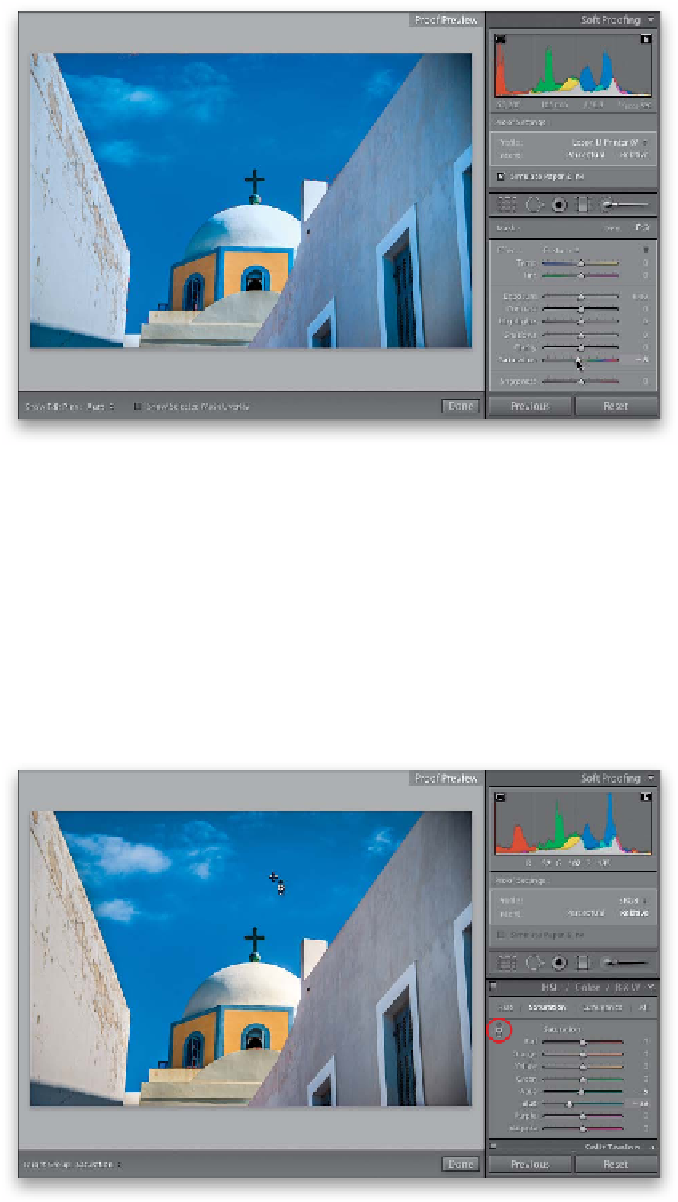
Step Six:
Another way to bring colors back into
gamut is (3) to use the HSL panel sliders.
But, first, while we still have the Adjustment
Brush, drag the Saturation slider back to 0
(so we have our gamut problem again) and
then close the brush (click on its icon). Now,
head down to the HSL panel and click on
Saturation. The easiest way to do this is to
take the TAT (Targeted Adjustment tool;
circled here) and, with the gamut warning
turned on, click on a red warning area and
drag downward. It automatically grabs any
Saturation color sliders that represent that
area and drags them to the left to desatu-
rate that area (here it moved the Aqua a
little and the Blue a lot). Again, you want
to desaturate as little as possible, so drag
back upward until you start to see red,
then drag back down just a tiny bit.