Graphics Programs Reference
In-Depth Information
Step Seven:
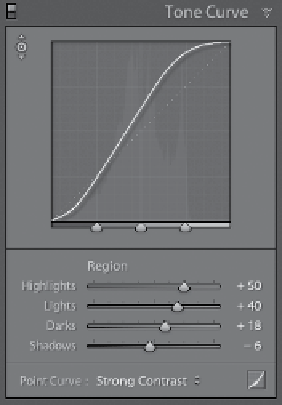
The final method of adjusting the tone
curve is to simply click-and-drag the
four Region sliders (Highlights, Lights,
Darks, and Shadows) near the bottom
of the panel, and as you do, it adjusts
the shape of the curve. Here, I dragged
the Highlights slider to the far right to
brighten the highlights. I dragged the
Darks to the right to open up the lower
midtones a bit, and I also dragged the
Shadows sliders to keep everything from
looking washed out. I moved the Lights
slider quite a bit to the right to bring out
some upper midtones and lower highlights.
Also, if you look at the sliders themselves,
they have the same little gradients behind
them like in the Basic panel, so you know
which way to drag (toward white to make
that adjustment lighter, or toward black
to make it darker). By the way, when you
adjust a curve point (no matter which
method you choose), a gray shaded area
appears in the graph showing you the
curve's boundary (how far you can drag
the curve in either direction).
Step Eight:
So, that's the scoop. To adjust your
photo's contrast, you're going to either:
(a) use a preset contrast curve from the
Point Curve pop-up menu, (b) use the
TAT and click-and-drag up/down in your
photo to adjust the curve, (c) use either
one of those two, then move the point
up/down using the
Arrow keys
on your
keyboard, or (d) manually adjust the curve
using the Region sliders.
Note:
If you find
that you're not using the sliders, you can
save space by hiding them from view (like
I mentioned earlier): click on the Point
Curve button to the right of the Point
Curve pop-up menu (shown circled here
in red). If you decide you want them back
one day, click that same button again.