Graphics Programs Reference
In-Depth Information
Step Three:
If you think the Strong Contrast preset
isn't strong enough (here, I think it needs a
lot more contrast), you can edit this curve
yourself, but it's helpful to know this rule:
the steeper you make the S-shaped curve,
the stronger the contrast. So to make this
curve steeper, you'd move the point near
the top of the curve (the highlights) up-
ward and the bottom of the curve (the
darks and shadows) downward. (
Note:
If
you see sliders beneath your curve graph,
you won't see the points on your curve.
Click on the Point Curve button to the
right of the Point Curve pop-up menu to
hide the sliders and see the points.) To
move your top point higher, move your
cursor right over the top point, and a
cursor with a two-headed arrow appears.
Just click-and-drag it upward (shown here)
and the image gets more contrasty in the
highlights. By the way, if you start with the
Linear curve, you'll have to add your own
points: Click about ¾ of the way up to add
a Highlights point, then drag it upward.
Add another about ¼ of the way up to
add a Shadows adjustment and drag down
until you have a steep S-shaped curve.
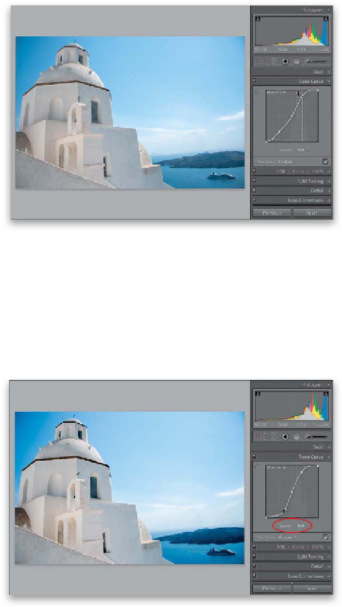
Step Four:
Here, I've dragged the Shadow point
down quite a bit (well, there are two, so
I dragged them both down) to make the
S-shaped curve steeper, and now I have a
more contrast in the highlight and shadow
areas. (
Remember:
The steeper the curve,
the more contrast you're applying.) Also, in
Lightroom 4, you can now adjust the indi-
vidual RGB (Red, Green, and Blue) channels
by clicking on the Channel pop-up menu
(shown circled here), choosing a channel to
edit, and dragging the curve to add more
contrast to that particular color channel.
TIP: Adding Mega-Contrast
If you did apply some Contrast in
the Basic panel, using the Tone Curve
actually adds more contrast on top of
that contrast, so you get mega-contrast.