HTML and CSS Reference
In-Depth Information
Figure 7.20
Opera's small
screen view
effect of a new handheld style sheet and a few XHTML
coding changes/additions to the navigation is a Web page
that is more usable and accessible for mobile visitors.
As mobile devices evolve and mobile bandwidth
improves, there are sure to be new developments in this
area of Web design. If you are interested in exploring
this topic further, you'll find the resources below
helpful.
●
●
●
●
●
FAQ
Will every mobile device use my “handheld” style sheet?
Many mobile devices will apply the handheld style sheet when displaying your Web page.
However, some mobile devices, such as the iPhone, iTouch, and Nokia Internet Tablet, run
mini-browsers that render the style sheet configured for
media="screen"
and ignore the
media="handheld"
style sheet. You'll need to test your mobile device. For a quick check,
visit
http://htmldog.com/test/handheld.html
to determine if your device applies a handheld
style sheet.
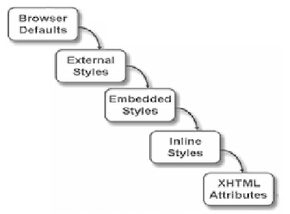
Figure 7.21 shows the “cascade” (
rules of precedence
) that applies the styles in order
from outermost (external styles) to innermost (actual XHTML coded on the page). This
way site-wide styles can be configured but overridden when needed by more granular
(or page-specific) styles.
Figure 7.21
The “cascade” of
Cascading Style
Sheets


Search WWH ::

Custom Search