HTML and CSS Reference
In-Depth Information
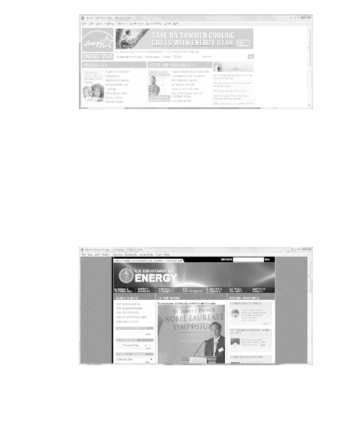
Figure 5.28
This page is
configured with a
fixed width and
demonstrates ice
design
The
jello design
technique configures content that is centered and may be of a fixed
width or a percentage width such as 80 percent. A CSS style rule that configures an id
named
wrapper
in this manner follows:
#wrapper { width: 80%;
margin-left: auto;
margin-right: auto;
}
Jello design pages typically are more pleasing to view at higher screen resolutions than
ice design pages. No matter the screen resolution, the content is centered in the page
with even margins on both sides. The Department of Energy site (
http://energy.gov),
as
shown in Figure 5.29, uses jello design. Other sites currently using this technique
include
http://www.pbs.org
and
http://www.officedepot.com.
Figure 5.29
The left and right
margins are
balanced on this
page using jello
design
The
liquid design
technique results in a fluid Web page with content that takes up 100
percent of the browser window regardless of the screen resolution. There is no blank
margin on the left or right—the multicolumn content will flow to fill whatever size
Search WWH ::

Custom Search