Database Reference
In-Depth Information
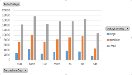
Figure 11.27
Pivot chart comparing delays for different days of the week.
Using PowerPivot models, pivot tables, and pivot charts in combination
with Excel formatting, you can create powerful interactive visualizations
and dashboards to explore the data. These Excel workbooks can be hosted
on SharePoint, where you can automate the refreshing of the data using a
schedule. You can also restrict access to the workbooks using SharePoint
security.
Rapid Big Data Exploration with Power View
As powerful as the pivot tables and pivot charts are in Excel, unless you are
an Excel power user, creating and formatting them can be quite a challenge.
With that in mind, Microsoft has created Power View as an add-in for Excel.
PowerViewstillusesthePowerPivotmodelasitsdatasource,butitmakesit
easier to create highly interactive data visualizations. It is ideal for the Excel
casual user who needs to explore the data for trends and insights:
1. Open the Excel workbook you created in the previous section. On the
Insert tab, you should see a Power View button. Click the button to
launch the Power View designer. It will create a new tab called Power
View 1. You should see the Power View Fields window, which contains
the tables and fields you created previously in the PowerPivot model
(see
Figure 11.28
). Notice the calculator icon associated with measures
you created in the model. In addition, a globe icon is associated with
any field that can be interpreted as a geolocation type field, such as
latitude, longitude, city, state, or county.