Database Reference
In-Depth Information
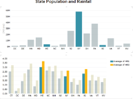
Figure 11.3
Chart highlighting in Power View.
If you have data that contains a date/time field, you can create a bubble
chart that includes a play axis that shows how the data changes over time.
PowerViewincludesamappingfeaturethatenablesvisualizationofthedata
on a Bing map layer that includes the ability to zoom in and out.
Figure 11.4
shows a map of rainfall for counties in Pennsylvania. The size of the bubble
represents the rainfall, and the color of the bubble represents the relative
size of the county's population.