Database Reference
In-Depth Information
In addition, PowerPivot supports creating custom calculations and
measures using Data Analysis Expressions (DAX), a feature that supports
efficient querying and sophisticated calculations on very large data sets.
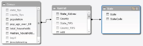
Figure 11.2
shows a model being developed in PowerPivot. It is combining
census data from Hadoop and rainfall data from a SQL Server database.
Figure 11.2
Creating a data model in PowerPivot.
Power View
Power View is an add-in to Excel that enables users to create highly
interactive data visualizations. You can easily create tables and matrices,
along with charts such as bar, pie, line, and bubble charts. Power View
reports use PowerPivot models as the data source. Because the model
provides both the tables and the relations between the tables, Power View
can link the various charts and tables together. Filtering one chart in a
view automatically propagates to other visualizations in the same view.
Furthermore, if the data model has hierarchies defined, you automatically
get the ability to drill up or down through the hierarchy in your charts and
matrices. Another useful feature of Power View is support for highlighting,
which allows you to examine a subset of the data while still showing the
rest of the data.
Figure 11.3
shows how highlighting a chart in the view also
highlights a chart with related data (State).