Graphics Programs Reference
In-Depth Information
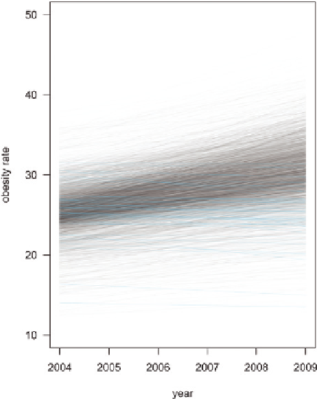
Figure 6-32 shows some quick sketches for lay-
out. I thought about using the time series plots,
but this data seemed better fit for maps over
time. People most likely want to examine their
own regions, and the time series obscures that.
Finally, Figure 6-33 is the final graphic. There's
a map for 2004 and another for 2009. The
histogram underneath each map doubles as
a legend for what range each shade of red
represents.
Notice the process that resulted in the final
graphic. Not every chart was used, and most of
the time was spent figuring out what the data
had to show. On FlowingData, readers often see
a visualization they like and then ask me what
software was used or how they can (quickly)
make the same thing with their data. It's just
not that straightforward a lot of the time. You
poke around, understand the data the best you
can, and then produce.
FIGURE 6-31
Time series version of maps in Figure 6-30 to look for patterns
WRAPPING UP
Regardless of the audience, you must step outside the dataset and consider
what it represents in the real world. Don't fall into the trap of thinking that
data is just digital output that sits alone on a hard drive and isolated in a
spreadsheet.
There's a saying popularized by Mark Twain that perhaps gives statistics a
bad name: “There are three kinds of lies: lies, damned lies, and statistics.”
People often misinterpret this as that there's dishonesty in numbers, but the
lies don't come from the numbers themselves. They stem from those who
use data incorrectly or irresponsibly. As you present data to others, it's your
responsibility to show the truth.
FIGURE 6-32
(following page)
Sketches for layout before moving
on to final graphic
Learn all you can about your data, and design your graphics based on those
findings. After that, the smaller things tend to fall in place.
Search WWH ::

Custom Search