Graphics Programs Reference
In-Depth Information
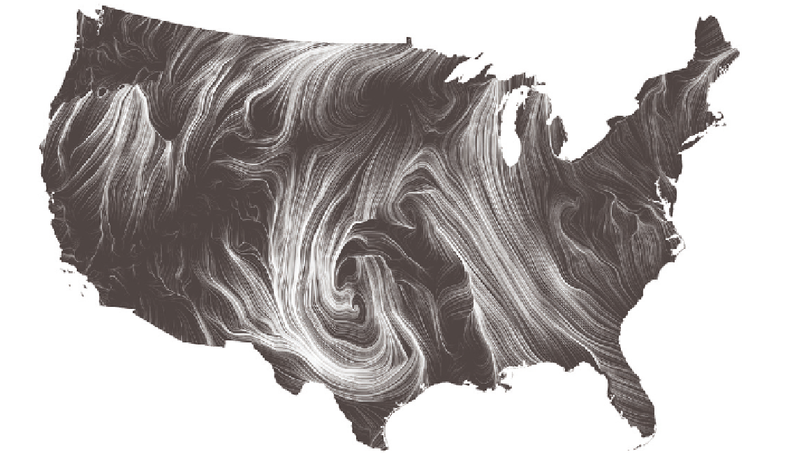
FIGURE 6-9
Wind Map
(2012) by Fernanda Viégas and Martin Wattenberg,
http://hint.fm/wind/
This applies to more basic charts, too. I used to make graphics for a data-ish
comic of sorts called
Data Underload
on FlowingData, and it was mostly an
excuse to play with colors and shapes. They were more conceptual than they
were based on real data but were designed as if they were based on real data.
For example, Figure 6-10 is a chart that shows imaginary sleep schedules based
on age. The information from WebMD was used for the average amount of
sleep, but the start and end times were just guesses. It was mostly for my
amusement, but some confused the chart for one that showed real data. A
major news publication even wanted to publish a version of the graphic, until
I explained that it was a comic.
Had the chart been drawn with pen on the back of a napkin, as shown in
Figure 6-11, the reader interpretation would be different. It looks far less serious
and would confuse fewer people.
Search WWH ::

Custom Search