Graphics Programs Reference
In-Depth Information
EXPERIMENT WITH TYPOGRAPHY
There have been plenty of polls and questionnaires that ask what the best
typeface is for visualization, but there's always a ton of variability, and there's
never any consensus. This might be because taste in typefaces has a lot to
do with personal preference. Nevertheless, it's worth exploring various fonts
for labels and annotation, outside of software defaults, which are generic
and less refined.
Note:
A typeface is a design for text, such as
Helvetica or Baskerville, and it pertains to the appear-
ance of the characters. A font is a specification for a
typeface, such as 10-point bold Baskerville.
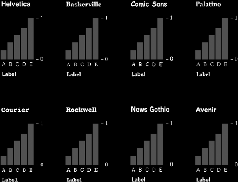
The effect of typeface choice is most obvious at the
extremes. Figure 5-38 shows the same graph with vari-
ous typefaces, and you can see how readability and feel
changes for each. For example, Helvetica, a sans-serif
FIGURE 5-38
Trying various fonts
Search WWH ::

Custom Search